
Introduction
Data visualization is an essential component of data analysis, allowing us to effectively communicate insights and patterns hidden within complex datasets. By visually representing data, we can gain a better understanding of the information at hand and make informed decisions.
In addition to traditional 2D data visualization, the use of three-dimensional (3D) visualization techniques has become increasingly popular. 3D data visualization offers a unique perspective, enabling the exploration of data in multiple dimensions and providing a more immersive and intuitive way to interpret information.
Overview of Data Visualization and Its Importance
Data visualization involves transforming raw data into visual representations such as charts, graphs, and plots. It plays a crucial role in data analysis as it helps us identify trends, patterns, and relationships that might be challenging to comprehend through raw data alone.
The importance of data visualization lies in its ability to simplify complex data and present it in a visually appealing and understandable format. By visualizing data, we can:
- Gain insights: Visual representations make it easier to identify patterns, outliers, and trends that may not be evident in raw data.
- Communicate effectively: Visualizations serve as a means of conveying findings and insights to stakeholders, making it possible to share information in a clear and concise manner.
- Make data-driven decisions: Visualizations empower decision-makers by providing a visual context that aids in understanding the implications of data, allowing for informed and strategic decision-making.
Introduction to 3D Data Visualization and Its Benefits
While 2D visualizations are effective in many cases, they often fall short when representing data with multiple variables or complex relationships. This is where 3D data visualization comes into play.
3D data visualization enables the exploration and representation of data in three dimensions, incorporating depth and perspective into the visualization. This additional dimension allows for a more comprehensive understanding of complex relationships and can reveal hidden patterns and insights.
Some benefits of 3D data visualization include:
- Enhanced depth perception: By adding depth to the visualization, 3D data visualizations provide a more realistic representation of the data, making it easier to perceive relative distances and relationships between different data points.
- Improved spatial understanding: 3D visualizations allow users to view data from different angles and perspectives, facilitating a better understanding of spatial relationships within the dataset.
- Increased interactivity: 3D visualizations often offer interactive features that enable users to manipulate the visualization, explore different viewpoints, and gain a more holistic understanding of the data.
- Better representation of complex relationships: 3D visualizations can more accurately represent complex relationships between multiple variables, making it easier to analyze and interpret complex datasets.
Python provides a range of libraries and tools, such as Matplotlib, Plotly, and Mayavi, that support 3D data visualization. With these libraries, you can create stunning and interactive 3D visualizations to explore and communicate your data effectively.
In conclusion, 3D data visualization is a powerful technique that enhances our ability to analyze and interpret complex datasets by providing a more immersive and intuitive representation. By leveraging Python’s capabilities and libraries, you can unlock the full potential of 3D data visualization and gain deeper insights from your data.
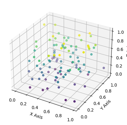
Technique 1: Scatter Plot in 3D
In this section, we will explore the scatter plot function in Python and learn how to create visually appealing and interactive plots in three dimensions.
Exploring the Scatter Plot Function in Python
Python provides a powerful library called Matplotlib that offers numerous plot types, including scatter plots. Scatter plots are useful for visualizing relationships between multiple variables in a dataset.
To create a scatter plot, we can use the scatter() function from the Matplotlib library. This function takes the x, y, and z coordinates of the data points as input and plots them as individual markers on a three-dimensional plane.
Using Colors and Sizes to Enhance the Plot
One way to enhance a scatter plot is by incorporating colors and sizes to convey additional information about the data points. We can assign different colors to different groups or categories present in the dataset, making it easier to distinguish between them. Similarly, the size of the markers can represent another dimension of the data, such as the magnitude or importance of a variable.
In Python, we can achieve this by specifying the c parameter in the scatter() function, which takes an array of colors, and the s parameter, which takes an array of sizes corresponding to each data point.
Implementing Interactivity and Tooltips
Interactivity adds another layer of engagement and functionality to our scatter plot. With interactivity, users can explore the plot in more detail and obtain additional information about individual data points.
Python provides various libraries, such as Plotly and Bokeh, that allow us to create interactive plots. These libraries offer features like tooltips, which display additional information about a data point when the user hovers over it.
By integrating interactivity and tooltips into our scatter plot, we can provide users with a richer and more informative visualization experience.
To summarize, the scatter plot function in Python is a powerful tool for visualizing data points in three dimensions. By incorporating colors, sizes, interactivity, and tooltips, we can create visually appealing and interactive plots that enhance data exploration and analysis.import matplotlib.pyplot as plt
from mpl_toolkits.mplot3d import Axes3D
import numpy as np
# Generating sample data
x = np.random.standard_normal(100)
y = np.random.standard_normal(100)
z = np.random.standard_normal(100)
fig = plt.figure()
ax = fig.add_subplot(111, projection=’3d’)
# Creating a scatter plot
scatter = ax.scatter(x, y, z, c=z, cmap=’viridis’, s=100)
# Adding color bar and labels
fig.colorbar(scatter, ax=ax, label=’Depth’)
ax.set_xlabel(‘X Axis’)
ax.set_ylabel(‘Y Axis’)
ax.set_zlabel(‘Z Axis’)
plt.show()

Technique 2: Surface Plotting
Surface plotting is a powerful technique for visualizing three-dimensional surfaces using Python. It allows us to explore complex data in a more intuitive and comprehensive manner.
Visualizing 3D Surfaces with Python
Python provides various libraries that make it easy to visualize 3D surfaces. One popular library is Matplotlib, which offers a wide range of functions and tools for creating high-quality plots.
To visualize a 3D surface using Matplotlib, we can use the plot_surface() function. This function takes in three main parameters: the coordinates of the points on the surface, the corresponding values at each point, and an optional colormap for coloring the surface.
By representing the X, Y, and Z coordinates of the surface points as arrays, we can create a meshgrid and calculate the corresponding Z values based on a mathematical function or real-world data. We can then pass these arrays to the plot_surface() function to generate the surface plot.
Creating Contour Plots for Better Understanding
Contour plots are another useful tool for visualizing 3D surfaces. They provide a way to represent the variation of a surface in two dimensions by using contour lines.
In Python, we can create contour plots using the contour() or contourf() functions from the Matplotlib library. The contour() function displays contour lines, while the contourf() function fills the areas between the contour lines with colors, which can be specified using a colormap.
To create a contour plot, we need to provide the X and Y coordinates of the points on the surface, as well as the corresponding Z values. We can then call the appropriate function and specify the number of contour levels we want to display.
Applying Color Maps and Shading Techniques
Color maps and shading techniques play a crucial role in enhancing the visual appeal and readability of surface plots.
Matplotlib offers a wide range of predefined color maps that can be used to color the surface based on the corresponding values. These color maps can be customized to suit the specific requirements of the plot.
Additionally, we can apply shading techniques to the surface plot to further enhance its appearance. One commonly used technique is the use of lighting effects. By simulating the interaction of light with the surface, we can create a more realistic and visually appealing representation.
To apply shading techniques, we can use the shade() function in Matplotlib. This function calculates the shading at each point on the surface based on the surface normals and the position of the light source. It then applies the shading to the surface plot, resulting in a more visually appealing output.
In conclusion, surface plotting in Python is a powerful technique for visualizing 3D surfaces. By leveraging libraries like Matplotlib, we can create interactive and informative plots that help us better understand complex data.

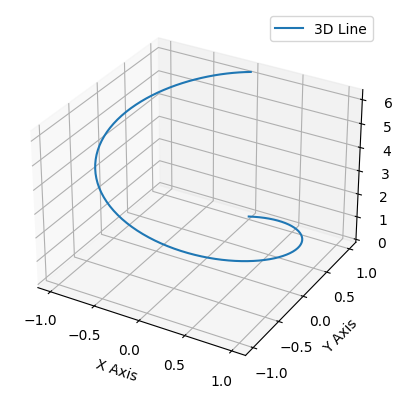
Technique 3: 3D Line Plotting
In the realm of data visualization, plotting lines in 3D space is a powerful technique that allows us to represent complex relationships and patterns. With this technique, we can effectively communicate information and insights by visualizing data in three dimensions. Let’s explore some key aspects of 3D line plotting:
Introduction to Plotting Lines in 3D Space
Plotting lines in 3D space involves representing data points as coordinates in x, y, and z axes. This technique allows us to visualize relationships between three variables simultaneously. By plotting lines, we can observe trends, patterns, and correlations within the data, providing a comprehensive understanding of the information.
Visualizing Time-Dependent Data with Animations
One of the strengths of 3D line plotting is its ability to visualize time-dependent data. By animating the lines over a specific time range, we can observe how the data changes and evolves over time. This dynamic representation not only enhances understanding but also allows us to identify temporal trends and patterns that may not be evident in static displays.
Adding Labels and Annotations to Enhance Clarity
To ensure clarity and comprehension, it is crucial to include labels and annotations in our 3D line plots. Labels can represent the different variables or data points, making it easier to interpret the visual information. Annotations, such as arrows or text, can provide additional context or highlight specific observations within the plot.
Including clear and concise labels and annotations helps the audience understand the significance of the plotted lines and facilitates effective communication of the insights derived from the data.
In summary, 3D line plotting is a valuable technique for visualizing complex relationships in data. By plotting lines in 3D space, we can observe patterns, trends, and correlations within the data and effectively communicate information. Adding labels and annotations enhances clarity, ensuring that the audience can interpret the plot accurately.import matplotlib.pyplot as plt
import numpy as np
fig = plt.figure()
ax = fig.add_subplot(111, projection=’3d’)
# Generate data
t = np.linspace(0, 2*np.pi, 100)
x = np.sin(t)
y = np.cos(t)
z = t
# Plot a 3D line
ax.plot(x, y, z, label=’3D Line’)
ax.legend()
ax.set_xlabel(‘X Axis’)
ax.set_ylabel(‘Y Axis’)
ax.set_zlabel(‘Z Axis’)
plt.show()
Technique 4: Volumetric Data Visualization
Volumetric data visualization is a technique used to represent and visually communicate information contained in three-dimensional datasets. By converting volumetric data into graphical representations, researchers and professionals can gain valuable insights and make informed decisions in various fields, including medicine, engineering, and scientific research.
Understanding Volumetric Data and its Applications
Volumetric data refers to three-dimensional datasets that contain information about the density, composition, or intensity of a particular variable. This type of data is typically obtained through techniques such as computed tomography (CT) scans, magnetic resonance imaging (MRI), or scientific simulations.
Volumetric data finds applications in various domains:
- Medical Imaging: Volumetric data from CT or MRI scans can be visualized to assist in the diagnosis and treatment planning of diseases. For example, visualizing volumetric data can help identify abnormalities in organs or tumors.
- Scientific Simulations: When simulating complex physical phenomena, such as fluid dynamics or molecular interactions, volumetric data can provide detailed insights into the behavior and properties of the simulated systems.
- Engineering and Design: Volumetric data visualization aids engineers and designers in analyzing and optimizing the performance of structures or products. For instance, visualization techniques can be used to examine stress distributions in mechanical components or fluid flow patterns in aerodynamics
Using Python Libraries to Render Volumetric Visualizations
Python offers several powerful libraries that facilitate the rendering and visualization of volumetric data. Some commonly used libraries include:
- Mayavi: Mayavi provides a high-level interface for interactive 3D visualization. It supports the rendering of volumetric data using techniques such as volume rendering, isosurface extraction, and slicing.
- PyVista: PyVista is a versatile Python library that enables the creation of interactive 3D visualizations from volumetric data. It offers a wide range of visualization capabilities, including volume rendering, contouring, and slicing.
- VisPy: VisPy is a library for high-performance scientific visualization. It provides functionalities for rendering volumetric data using GPU acceleration, allowing for real-time interaction and exploration.
These libraries provide a range of customizable options to enhance the visual representation of volumetric data, such as adjusting color maps, applying shading effects, and selecting different rendering techniques.import numpy as np
import matplotlib.pyplot as plt
from mpl_toolkits.mplot3d import Axes3D
# Generate synthetic data
data = np.random.rand(100, 3)
x, y, z = data[:,0], data[:,1], data[:,2]
fig = plt.figure()
ax = fig.add_subplot(111, projection=’3d’)
# Simple scatter plot to represent volumetric data points
ax.scatter(x, y, z, c=z, cmap=’viridis’)
ax.set_xlabel(‘X Axis’)
ax.set_ylabel(‘Y Axis’)
ax.set_zlabel(‘Z Axis’)
plt.show()
Applying Transfer Functions and Opacity Mapping
Transfer functions and opacity mapping are fundamental techniques used in volumetric data visualization to control the visual appearance and highlight specific properties of the data.
- Transfer Functions: Transfer functions map the raw data values to visual attributes, such as color and transparency. By assigning different colors and opacities to different data values, transfer functions can emphasize certain features or structures present in the volumetric data.
- Opacity Mapping: Opacity mapping determines the transparency of the rendered voxels based on their data values. It allows users to control the visibility of specific regions within the volumetric dataset. For example, by adjusting the opacity mapping, one can make certain structures more transparent or completely opaque, depending on their significance.
By applying transfer functions and opacity mapping techniques, users can effectively extract meaningful information from volumetric data and highlight specific areas of interest.
In conclusion, volumetric data visualization is a powerful technique that enables the exploration and analysis of three-dimensional datasets. By using Python libraries and applying transfer functions and opacity mapping, professionals can create informative and visually appealing renderings that facilitate data interpretation and decision-making in various fields.
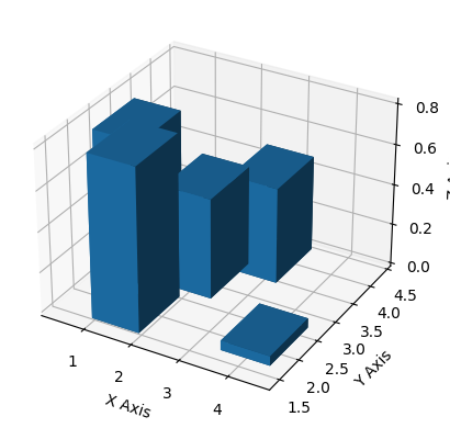
Technique 5: 3D Bar Plotting
In this section, we will explore the technique of creating 3D bar plots using Python. These plots allow us to visualize data in a three-dimensional space, adding an extra dimension to the information being represented. We will cover the process of customizing bar colors, sizes, and orientations in our plots. Additionally, we will learn how to add error bars and confidence intervals to our 3D bar plots.
Creating Bar Plots in 3D Space with Python
To create 3D bar plots with Python, we can use various libraries such as Matplotlib, Plotly, and Seaborn. These libraries provide functions and tools to generate visually appealing and informative plots.
Customizing Bar Colors, Sizes, and Orientations
To customize the appearance of our 3D bar plots, we can modify different attributes such as bar colors, sizes, and orientations. For example, using Matplotlib, we can set the color of the bars by specifying a color map or assigning specific colors to each bar. Similarly, we can adjust the size of the bars using the width parameter and control their orientation with the align parameter.
Adding Error Bars and Confidence Intervals
Error bars and confidence intervals are essential for visualizing the uncertainty associated with our data. They provide a range of values that represent the variability or confidence of our estimated measurements. In 3D bar plots, we can add error bars or confidence intervals by using the appropriate functions provided by the plotting library. These functions allow us to specify the error or confidence values for each bar and visualize them accordingly.
By incorporating error bars and confidence intervals into our 3D bar plots, we can provide additional information to our audience, making the plots more informative and reliable.
In summary, the technique of 3D bar plotting in Python allows us to represent data in a three-dimensional space, enriching the visualization with an additional dimension. By customizing the bar colors, sizes, and orientations, we can create visually appealing and easily understandable plots. Furthermore, the inclusion of error bars and confidence intervals adds valuable information about the uncertainty associated with the data. With these techniques at our disposal, we can effectively communicate complex data in a more comprehensive and visually engaging manner.import matplotlib.pyplot as plt
import numpy as np
fig = plt.figure()
ax = fig.add_subplot(111, projection=’3d’)
# Sample data
x, y = np.random.rand(2, 5) * 4
z = np.zeros(5)
dx = dy = np.ones(5)
dz = np.random.rand(5) * 2
ax.bar3d(x, y, z, dx, dy, dz)
ax.set_xlabel(‘X Axis’)
ax.set_ylabel(‘Y Axis’)
ax.set_zlabel(‘Z Axis’)
plt.show()
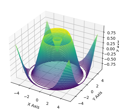
Technique 6: 3D Contour Plotting
In data visualization, 3D contour plotting is a powerful technique for representing the contours of a function or dataset in three-dimensional space. With the help of Python libraries and tools, you can effectively visualize and analyze complex data by creating 3D contour plots. This technique allows you to gain insights into the relationships between variables and identify patterns, trends, and anomalies.
Visualizing Contours in 3D using Python
Python offers several powerful libraries for creating 3D contour plots, including Matplotlib, Plotly, and Mayavi. These libraries provide various functions and methods to generate interactive and customizable plots that enhance data exploration and understanding.
To visualize contours in 3D using Python, you can follow these steps:
- Import the required libraries: Begin by importing the necessary libraries, such as Matplotlib, NumPy, and SciPy.
- Generate your data: Prepare the data for plotting by creating a grid of values over the desired input space. This can be done using the NumPy
meshgridfunction. - Compute the contour values: Use the desired function or dataset to compute the contour values at each point in the grid. This can be done with the help of the SciPy
contourorcontourffunctions. - Create the 3D plot: With the contour values computed, you can use the appropriate functions from Matplotlib or Plotly to create the 3D contour plot. Customize the plot by adjusting parameters such as color schemes, line styles, and marker types.
- Add labels, titles, and legends: Enhance the plot’s readability by adding axis labels, a title, and a legend to provide context and clarify the information presented.
Adjusting Contour Levels and Smoothing Techniques
Contour plots represent data by dividing it into regions based on their values. Adjusting contour levels can reveal more detail and provide a clearer understanding of the data. You can control the number and spacing of contour levels by specifying the levels parameter when creating the contour plot.
In addition to adjusting contour levels, you can apply smoothing techniques to improve the visual representation of the data. Smoothing reduces noise and enhances the overall appearance of the contours. Python libraries offer various smoothing methods, such as Gaussian smoothing or interpolation algorithms, which can be applied to the data before plotting the contours.
Overlaying Contour Plots on Other Visualizations
To gain further insights or provide additional context, you can overlay contour plots on other types of visualizations. Python libraries like Matplotlib and Plotly allow you to combine different types of plots, such as scatter plots or surface plots, with contour plots.
Overlaying contour plots on other visualizations can help highlight relationships and patterns between variables by visually representing multiple dimensions simultaneously. This technique enhances the comprehensibility of the data and enables a more comprehensive analysis.
In summary, 3D contour plotting is a powerful technique for visualizing contours in three-dimensional space using Python. By adjusting contour levels, applying smoothing techniques, and overlaying contour plots on other visualizations, you can effectively analyze and interpret complex data, uncovering valuable insights and patterns.import matplotlib.pyplot as plt
from mpl_toolkits.mplot3d import Axes3D
import numpy as np
fig = plt.figure()
ax = fig.add_subplot(111, projection=’3d’)
x = np.linspace(-5, 5, 50)
y = np.linspace(-5, 5, 50)
X, Y = np.meshgrid(x, y)
Z = np.sin(np.sqrt(X**2 + Y**2))
# Create a contour plot
ax.contour3D(X, Y, Z, 50, cmap=’viridis’)
ax.set_xlabel(‘X Axis’)
ax.set_ylabel(‘Y Axis’)
ax.set_zlabel(‘Z Axis’)
plt.show()
Technique 7: Interactive 3D Visualizations
Interactive 3D visualizations are a powerful way to engage users and convey complex data or concepts in a dynamic and immersive manner. In this technique, we will explore how to build interactive 3D visualizations using Python, along with techniques for incorporating user input and controlling the visuals through interactivity.
Building Interactive 3D Visualizations with Python
Python offers several libraries that enable the creation of interactive 3D visualizations, including Matplotlib, Plotly, and Mayavi. These libraries provide a range of tools and functionalities to generate and manipulate 3D plots, allowing you to create visually compelling and interactive graphics.
To get started, you’ll need to install the desired library using the package manager pip. For example, to install Matplotlib, you can run the following command in your terminal:pip install matplotlib
Once you have the library installed, you can import it into your Python script or Jupyter Notebook and begin creating your 3D visualization.
Using Widgets and Sliders for User Input
To enhance the interactivity of your 3D visualizations, you can integrate widgets and sliders into your code. Widgets provide a user-friendly interface for users to interact with the visualization, allowing them to manipulate parameters or modify the displayed data in real-time.
In Python, the ipywidgets library provides a wide variety of interactive widgets that can be easily incorporated into your code. By adding widgets such as sliders, buttons, or dropdown menus, users can actively control aspects of the 3D visualizations, such as zooming, rotating, changing color schemes, or adjusting data ranges.
These widgets can be linked to specific functions or variables within your code, enabling immediate updates to the visualization based on user input.
Animating and Controlling Visualizations with Interactivity
In addition to using widgets and sliders, you can also incorporate animation and control mechanisms to enhance the interactivity of your 3D visualizations.
Python offers several animation libraries, including Matplotlib.animation and Plotly Express, which allow you to create dynamic and visually appealing animations. By defining keyframes or transitions, you can animate the movement, transformation, or modification of elements in your 3D visualizations.
Interactive controls, such as buttons or checkboxes, can be added to enable users to start, pause, or modify the animation parameters. This level of interactivity empowers users to explore the visualizations at their own pace, gaining a deeper understanding of the data or concepts being presented.
By combining widgets, sliders, animation, and interactive controls, you can create immersive and engaging 3D visualizations that effectively convey your message and captivate your audience.
In conclusion, interactive 3D visualizations provide a compelling way to present complex data or concepts. By building these visualizations with Python, incorporating widgets and sliders for user input, and utilizing animation and interactive controls, you can create interactive and engaging visual experiences. Whether you’re visualizing scientific data, architectural designs, or conceptual models, interactive 3D visualizations can enhance understanding, enable exploration, and captivate your audience.import plotly.graph_objects as go
import numpy as np
# Sample data
x = np.random.standard_normal(100)
y = np.random.standard_normal(100)
z = np.random.standard_normal(100)
fig = go.Figure(data=[go.Scatter3d(
x=x, y=y, z=z,
mode=’markers’,
marker=dict(
size=12,
color=z, # set color to an array/list of desired values
colorscale=’Viridis’, # choose a colorscale
opacity=0.8
)
)])
# Set layout options
fig.update_layout(margin=dict(l=0, r=0, b=0, t=0))
fig.show()

Conclusion: Unlocking the Potential of 3D Data Visualization
In this article, we have explored various techniques of 3D data visualization and discussed their applications in different fields.
Summary of Techniques Explored: We began by highlighting the importance of data visualization and its role in understanding complex datasets. We then delved into the world of 3D data visualization, discussing techniques such as volume rendering, surface rendering, and virtual reality (VR) visualization. Each technique offers unique ways to represent and interact with data in a three-dimensional space, providing deeper insights and facilitating better decision-making.
Applications and Future Developments: We also examined the wide range of applications for 3D data visualization across various industries. From healthcare to architecture, from finance to gaming, 3D data visualization has proven to be a valuable tool in analyzing and presenting data in a visually compelling manner.
Looking ahead, the future of 3D data visualization holds even more promise. Advancements in technology, such as increased computing power and improved graphics capabilities, will enable us to create more complex and realistic visualizations. Additionally, the integration of machine learning and artificial intelligence algorithms will enhance our ability to extract meaningful insights from vast amounts of data.
Furthermore, the evolution of virtual reality (VR) and augmented reality (AR) technologies will elevate the immersive experience of 3D data visualization, allowing users to interact with data in unprecedented ways.
In conclusion, 3D data visualization has unlocked the potential for more intuitive and comprehensive data exploration. Its applications span diverse industries, and as technology continues to advance, we can expect even more exciting developments in this field. By harnessing the power of 3D data visualization, we can gain deeper insights, make better decisions, and unlock new possibilities for innovation.
For references and more information: