
Heatmaps and correlation matrices are powerful visualization tools that play a crucial role in data analysis. By visually representing relationships and patterns within a dataset, they provide valuable insights and aid in making informed decisions. This section will provide an overview of heatmaps and correlation matrices, highlighting their importance in data analysis.
Overview of Heatmaps and Correlation Matrices
Heatmaps are graphical representations that use color-coded squares to visualize the intensity or values of a dataset. They are particularly useful for representing matrices or tables of data, where each cell’s color indicates the magnitude of the value it represents. Heatmaps allow analysts to quickly identify patterns, trends, and clusters within the dataset, providing a clear and concise visual representation.
Correlation matrices are square matrices that depict the correlation between different variables in a dataset. Each cell in the matrix displays a correlation coefficient, ranging from -1 to 1, representing the strength and direction of the relationship between two variables. Correlation matrices help in understanding how variables are related to each other, enabling data analysts to identify relationships, dependencies, and potential causal links.
Importance of Visualization in Data Analysis
Visualization plays a critical role in data analysis as it allows analysts to communicate complex information in a concise and understandable manner. Here are some key reasons why visualization using heatmaps and correlation matrices is important in data analysis:
- Identifying Patterns and Trends: Heatmaps enable analysts to quickly identify patterns, clusters, and trends within the dataset. By visually representing data, patterns that may not be apparent in tabular form become more evident, facilitating data exploration and hypothesis generation.
- Exploring Relationships: Correlation matrices provide a visual representation of the relationships between variables. By observing the correlation coefficients, analysts can identify strong positive or negative relationships, helping them understand the impact of one variable on another.
- Simplifying Complex Data: Heatmaps and correlation matrices condense and simplify complex data, making it easier to comprehend and interpret. By visually representing large amounts of data, analysts can detect outliers, anomalies, and data distribution patterns more effectively.
- Enhancing Decision Making: Effective visualization using heatmaps and correlation matrices aids in making informed decisions. By providing clear and concise information, these visual representations enable analysts to derive insights and take appropriate actions based on the data patterns.
Exploring Heatmaps: Visualizing Patterns and Relationships
Heatmaps are powerful visualization tools that provide insights into patterns and relationships within data. They are widely used in various industries to analyze and interpret information. In this section, we will delve into the basics of creating heatmaps in Python, explore the applications of heatmaps in different industries, and present specific examples of heatmaps in finance, biology, and social sciences.
Basics of Creating a Heatmap in Python
Python offers several libraries, such as Matplotlib, Seaborn, and Plotly, that make it relatively straightforward to create heatmaps. Here is a brief overview of the steps involved:
- Import the necessary libraries: Start by importing the required Python libraries for data analysis and visualization, such as Pandas, NumPy, and the chosen visualization library.
- Prepare the data: Ensure that your data is in a format suitable for creating a heatmap. This typically involves organizing the data into a matrix or a table-like structure, where rows represent categories or variables, and columns represent observations or values.
- Choose a colormap: Select an appropriate colormap to represent the range of values in your data. Colormaps assign different colors to different values, enabling users to identify patterns and trends easily. Examples include sequential, diverging, and categorical colormaps.
- Create the heatmap: Use the chosen visualization library to create the heatmap. Specify the input data, colormap, labels for rows and columns, and any additional customization options, such as annotations and colorbar.
- Customize and enhance: Further customize and enhance the heatmap by adjusting the color scale, adding titles and subtitles, modifying the axis labels, and incorporating additional elements, such as legends or data overlays.
# Import necessary libraries
import seaborn as sns
import matplotlib.pyplot as plt
import numpy as np
# Generate a sample correlation matrix
np.random.seed(0)
data = np.random.rand(10, 12)
correlation_matrix = np.corrcoef(data)
# Create a heatmap
sns.heatmap(correlation_matrix, annot=True, cmap=’coolwarm’)
plt.title(‘Sample Correlation Matrix Heatmap’)
plt.show()

Heatmap Applications in Various Industries
Heatmaps find applications in a wide range of industries, aiding decision-making, identifying trends, and facilitating data-driven insights. Here are some examples:
- Finance: Heatmaps are employed in finance to visualize stock market performance, portfolio diversification, and risk assessment. They help investors identify correlations between different stocks, sectors, or asset classes and make informed investment decisions.
- Biology: In biology, heatmaps are used to analyze gene expression patterns, DNA sequencing data, and protein interactions. They assist researchers in identifying clusters of genes that exhibit similar behavior and understanding complex relationships within biological systems.
- Social Sciences: Heatmaps are valuable tools in social sciences for visualizing spatial distribution, population density, and demographic patterns. Sociologists, urban planners, and policymakers use heatmaps to study patterns of crime, segregation, or resource allocation within cities and regions.
Examples of Heatmaps in Finance, Biology, and Social Sciences
- Finance: A heatmap of stock prices can reveal patterns of correlation or divergence. It can show how different stocks move together (positive correlation) or move in opposite directions (negative correlation), enabling investors to construct well-diversified portfolios.
- Biology: A gene expression heatmap can depict the activity levels of thousands of genes across different experimental conditions. It helps researchers identify genes that are upregulated (higher expression) or downregulated (lower expression) under specific treatments or stimuli.
- Social Sciences: A heatmap of crime rates in a city can highlight high-crime areas and assist law enforcement agencies in deploying resources strategically. It can also aid policymakers in identifying patterns of criminal activity and designing targeted interventions.
In conclusion, heatmaps are robust visualization tools that allow us to explore patterns and relationships within data effectively. By utilizing Python libraries and understanding their applications in various industries, we can leverage heatmaps to gain valuable insights and make informed decisions.
Understanding Correlation Matrices: Uncovering Hidden Insights
Correlation matrices play a vital role in analyzing the relationships between variables in a dataset. By providing a concise summary of the pairwise correlations between variables, correlation matrices help uncover hidden insights and patterns that can inform decision-making and further analysis. Let’s delve deeper into the definition and purpose of correlation matrices, as well as how to calculate and interpret correlation coefficients.
Definition and Purpose of Correlation Matrices
A correlation matrix is a table that displays the correlation coefficients between multiple variables in a dataset. Each cell in the matrix represents the correlation between two variables, with values ranging from -1 to 1. Correlation coefficients measure the strength and direction of the linear relationship between two variables, indicating how changes in one variable are related to changes in another.
The primary purpose of correlation matrices is to provide a comprehensive overview of the relationships between variables. They offer insights into which variables are positively or negatively correlated, allowing analysts to identify patterns, dependencies, and potential causal relationships. Correlation matrices are commonly used in fields such as finance, economics, psychology, and social sciences.import pandas as pd
import seaborn as sns
import matplotlib.pyplot as plt
# Assuming ‘data’ is a Pandas DataFrame with your dataset
# Generate a synthetic dataset
np.random.seed(0)
data = pd.DataFrame({
‘Variable1’: np.random.randn(100),
‘Variable2’: np.random.randn(100) * 1.5 + 0.5,
‘Variable3’: np.random.randn(100) * 0.5 – 0.5,
‘Variable4’: np.random.randn(100) * 0.2 – 0.1
})
# Calculate the correlation matrix
correlation_matrix = data.corr()
# Visualize the correlation matrix
sns.heatmap(correlation_matrix, annot=True, cmap=’coolwarm’, center=0)
plt.title(‘Correlation Matrix of Variables’)
plt.show()

Calculating and Interpreting Correlation Coefficients
To calculate correlation coefficients, various methods can be used, with the most common being Pearson’s correlation coefficient. This coefficient measures the linear relationship between two continuous variables. It ranges from -1 to 1, with 1 indicating a perfect positive correlation, -1 indicating a perfect negative correlation, and 0 indicating no correlation.
Interpreting correlation coefficients involves considering both their magnitude and direction. The following guidelines can be followed:
- A coefficient close to 1 or -1 indicates a strong correlation between the variables. For example, a coefficient of 0.9 suggests a strong positive relationship, while a coefficient of -0.7 suggests a strong negative relationship.
- A coefficient close to 0 or a small absolute value indicates a weak or no correlation between the variables. For instance, a coefficient of 0.2 suggests a weak positive relationship, while a coefficient of -0.1 suggests a weak negative relationship.
- The sign of the coefficient indicates the direction of the relationship. A positive coefficient implies that as one variable increases, the other variable also tends to increase. Conversely, a negative coefficient implies that as one variable increases, the other variable tends to decrease.
When interpreting correlation coefficients, it’s important to note that correlation does not imply causation. Two variables may have a strong correlation, but it does not necessarily mean that one variable causes changes in the other. Correlation only measures the strength and direction of the relationship between variables.
In conclusion, correlation matrices serve as powerful tools for uncovering hidden insights in a dataset. By calculating and interpreting correlation coefficients, analysts can gain valuable insights into the relationships between variables, which can inform decision-making and further analysis.
Visualizing Correlation Matrices: Techniques and Tools in Python
Correlation matrices are widely used in data analysis to understand the relationships between variables. Visualizing these matrices can provide valuable insights into the data. In this section, we will explore techniques and tools for effectively visualizing correlation matrices in Python.
Using seaborn and matplotlib libraries for correlation matrix visualization
Seaborn and matplotlib are popular Python libraries that offer powerful tools for data visualization, including correlation matrix visualization. Here’s how you can use them to visualize your correlation matrices:import pandas as pd
import seaborn as sns
import matplotlib.pyplot as plt# Load or simulate a dataset
data = pd.DataFrame(data=np.random.rand(100, 4), columns=[‘A’, ‘B’, ‘C’, ‘D’])# Calculate the correlation matrix
corr = data.corr()# Generate a mask for the upper triangle
mask = np.triu(np.ones_like(corr, dtype=bool))# Set up the matplotlib figure
f, ax = plt.subplots(figsize=(11, 9))# Draw the heatmap with the mask and correct aspect ratio
sns.heatmap(corr, mask=mask, cmap=’coolwarm’, vmax=.3, center=0,
square=True, linewidths=.5, annot=True, cbar_kws={“shrink”: .5})plt.title(‘Correlation Matrix with Heatmap’)
plt.show()

The sns.heatmap() function from seaborn generates a colored heatmap, where color intensity represents the strength of the correlation. The cmap="coolwarm" argument sets the color scheme to cool to warm shades. The annot=True argument displays the correlation coefficient values on the heatmap.
Customization options for clarity and aesthetics
To enhance the clarity and aesthetics of your correlation matrix visualization, you can customize various aspects of the plot. Here are some customization options you can consider:
- Title: Add a descriptive title to your correlation matrix plot using the
plt.title()function. - Axis Labels: Rotate the x-axis and y-axis labels if the variable names are long and overlapping using
plt.xticks(rotation=45)andplt.yticks(rotation=0). - Color Map: Choose a different color map that suits your preference and data by modifying the
cmapargument insns.heatmap(). - Cell Size: Adjust the size of the individual cells in the heatmap using the
cbar_kws={"shrink": 0.7}argument. A smaller value will produce smaller cells. - Font Size: Increase or decrease the font size of the correlation coefficient values using the
annot_kws={"size": 10}argument insns.heatmap().
By tweaking these customization options, you can create correlation matrix visualizations that effectively convey the relationships between variables while maintaining aesthetic appeal.
In summary, seaborn and matplotlib in Python provide powerful tools for visualizing correlation matrices. By leveraging these libraries and customizing your plots, you can create visually appealing and informative representations of your data.
Analyzing Financial Data through Heatmaps and Correlation Matrices
In this case study, we will explore how to analyze financial data using heatmaps and correlation matrices. By visualizing the relationships between variables and interpreting the correlation matrix, we can make informed investment decisions.
Loading and Preprocessing Financial Data
The first step in analyzing financial data is to load and preprocess the data. This involves obtaining the necessary data from reliable sources and organizing it in a format suitable for analysis. Preprocessing may include tasks such as cleaning the data, handling missing values, and scaling the variables if required.
Creating a Heatmap
Once the financial data has been preprocessed, we can create a heatmap to visualize the relationships between variables. A heatmap is a graphical representation that uses color-coded cells to display the correlation between different variables. The correlation is calculated using statistical measures such as Pearson’s correlation coefficient.
By examining the heatmap, we can identify patterns and trends in the data. Variables that are positively correlated (have a strong positive relationship) will be displayed in similar colors, while variables that are negatively correlated (have a strong negative relationship) will be displayed in contrasting colors.
Interpreting the Correlation Matrix
In addition to the heatmap, we can also analyze the correlation matrix to gain further insights into the relationships between variables. The correlation matrix is a numerical representation of the correlations between all pairs of variables in the dataset.
By studying the correlation matrix, we can identify variables that have a strong positive or negative correlation with each other. This information can help us make informed decisions when selecting investment opportunities. For example, if two variables have a high positive correlation, it suggests that they tend to move in the same direction, and investing in both might not provide sufficient diversification.
Conversely, if two variables have a high negative correlation, it suggests that they tend to move in opposite directions, and investing in both might provide diversification benefits. By considering the correlation matrix, we can identify potential investment opportunities and manage risk effectively.
By employing heatmaps and correlation matrices in our financial analysis, we can gain valuable insights into the relationships between variables and make informed investment decisions. These tools help us understand the dynamics of the financial market and identify potential opportunities or risks.
Heatmaps and Correlation Matrices in Biological Research
Heatmaps and correlation matrices have become valuable tools in the field of genomics, aiding researchers in identifying gene expression patterns and understanding genetic interactions. These visual representations provide crucial insights into biological processes and facilitate the analysis of large-scale genomic data.
Applying Heatmaps and Correlation Matrices in Genomics
Heatmaps are graphical representations of data where individual values are color-coded to show their intensity or magnitude. In genomics, heatmaps are commonly used to visualize gene expression levels across different conditions or samples. By plotting gene expression data on a heatmap, researchers can identify patterns, clusters, and relationships within the data.
Correlation matrices, on the other hand, provide a quantitative representation of the relationships between genes or other molecular features. They measure the strength of the linear relationship between two variables, such as gene expression levels, within a given dataset. Correlation matrices help researchers identify co-expression patterns and reveal potential genetic interactions.
Identifying Gene Expression Patterns
Heatmaps play a crucial role in identifying gene expression patterns, allowing researchers to visualize the relative expression levels of genes across different conditions or samples. By color-coding the expression levels, researchers can quickly identify genes that are upregulated (high expression) or downregulated (low expression) in specific situations.
Gene expression patterns can provide insights into the underlying biological processes or cellular responses. For example, in cancer research, heatmaps can reveal genes that are dysregulated in tumor tissues compared to normal tissues, highlighting potential biomarkers or therapeutic targets.
Understanding Genetic Interactions
Correlation matrices help researchers understand genetic interactions by quantifying the strength and directionality of relationships between genes or molecular features. By analyzing the correlations between different genes, scientists can determine if certain genes tend to be co-regulated, indicating potential functional connections or shared regulatory mechanisms.
Genetic interactions play a crucial role in various biological processes, such as signaling pathways, gene regulatory networks, or disease mechanisms. Correlation matrices enable researchers to identify clusters of genes that exhibit high correlations, potentially indicating co-regulation or functional relationships.
In summary, heatmaps and correlation matrices are powerful tools in genomic research, allowing researchers to visualize gene expression patterns and identify genetic interactions. These visual representations enhance our understanding of biological processes and contribute to advancements in fields such as disease research, drug discovery, and personalized medicine.
Social Networks and Heatmap Visualization
In the era of social media, understanding and analyzing social network data has become crucial for businesses and researchers alike. One effective way to gain insights into connections and relationships within a social graph is through the visualization technique known as heatmaps.
Analyzing Social Network Data Using Heatmaps
Heatmaps provide a visual representation of data, with color intensity indicating the strength or density of a particular attribute or relationship. When applied to social network data, heatmaps can reveal patterns, clusters, and connections that are not easily apparent in raw data.
To analyze social network data using heatmaps, the following steps can be taken:
- Data Collection: Gather relevant data from the social network, including user profiles, connections, interactions, and any other pertinent information.
- Data Preprocessing: Clean and organize the data to ensure accuracy and consistency. This may involve removing duplicates, normalizing data formats, and handling missing values.
- Network Analysis: Use graph theory and network analysis techniques to identify important nodes (users), clusters, and community structures within the social network.
- Attribute Selection: Determine the attributes or relationships of interest that you want to visualize using a heatmap. These may include friendship connections, interaction frequency, influence scores, or any other metric that reflects the underlying network dynamics.
- Heatmap Generation: Create a heatmap using appropriate visualization tools or programming libraries. Assign colors to represent different attribute values, with darker shades indicating higher intensity or stronger relationships.
- Interpretation: Analyze the heatmap to identify patterns, trends, and interesting insights. Pay attention to hotspots (highly connected regions), cold spots (sparsely connected regions), and any other notable features that can inform decision-making or further investigation.
Visualizing Connections and Relationships within a Social Graph
Heatmap visualization can provide valuable insights into connections and relationships within a social graph. By representing the intensity or strength of relationships between nodes, heatmaps can reveal clusters, communities, and overall network dynamics.
Some common applications of heatmap visualization in social network analysis include:
- Friendship Network: Visualizing the strength of friendship connections between individuals, helping identify influential users or groups.
- Interaction Patterns: Analyzing interaction frequency between users to identify central nodes or communities with high interconnectivity.
- Information Diffusion: Examining the spread of information or influence within a network, highlighting influential users or key pathways.
- User Behavior: Visualizing user behaviors or preferences, such as likes, shares, or comments, to identify patterns and trends.
By visualizing social network data using heatmaps, researchers and businesses can gain a deeper understanding of the underlying network structure, identify influential nodes, and make data-driven decisions for targeted marketing campaigns, user engagement strategies, or community management initiatives.
In conclusion, heatmaps offer a powerful visualization technique for analyzing social network data. By representing attribute values or relationship intensities, heatmaps allow researchers and businesses to gain valuable insights into connections and relationships within a social graph, leading to informed decision-making and effective strategies.import networkx as nx
import numpy as np
import seaborn as sns
import matplotlib.pyplot as plt
# Create a sample social graph with weighted edges
G = nx.Graph()
edges = [(‘Alice’, ‘Bob’, 5), (‘Bob’, ‘Cindy’, 3), (‘Alice’, ‘Cindy’, 2),
(‘Cindy’, ‘Dave’, 7), (‘Dave’, ‘Eve’, 4), (‘Eve’, ‘Alice’, 1)]
G.add_weighted_edges_from(edges)
# Create an adjacency matrix from the social graph
# Using to_numpy_array for NetworkX 2.4 and later
adjacency_matrix = nx.to_numpy_array(G)
labels = list(G.nodes())
# Visualize the heatmap
sns.heatmap(adjacency_matrix, annot=True, xticklabels=labels, yticklabels=labels, cmap=’coolwarm’)
plt.title(‘Social Graph Connections Heatmap’)
plt.show()

Advanced Techniques: Enhancing Heatmap and Correlation Matrix Visualizations
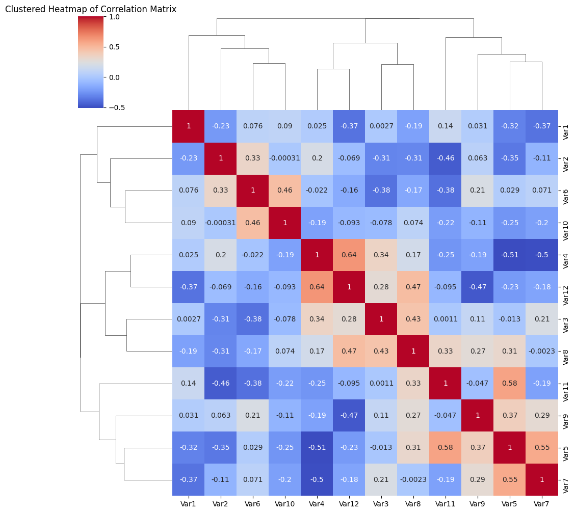
When it comes to visualizing data, heatmaps and correlation matrices are powerful tools that can provide insights into complex datasets. However, there are advanced techniques that can enhance these visualizations to make them even more informative and engaging. In this section, we will explore three techniques: heatmap annotations and clustering, creating interactive heatmaps with Plotly, and visualizing correlation matrices with dendrograms.import seaborn as sns
import matplotlib.pyplot as plt
import pandas as pd
import numpy as np
# Assuming ‘data’ is a DataFrame with your data
# Generate a sample dataset
np.random.seed(10)
data = pd.DataFrame(data=np.random.rand(12, 12), columns=[f’Var{i+1}’ for i in range(12)])
# Calculate the correlation matrix
corr = data.corr()
# Generate a clustermap
sns.clustermap(corr, cmap=”coolwarm”, annot=True)
plt.title(‘Clustered Heatmap of Correlation Matrix’)
plt.show()
Heatmap Annotations and Clustering Techniques
Heatmap annotations allow for the inclusion of additional information within the cells of a heatmap. This can be particularly useful when working with large datasets or when there is a need to highlight specific values or patterns. Annotations can provide context and add clarity to the visualization.
Clustering techniques can be applied to heatmaps to uncover patterns and relationships within the data. By rearranging the rows and columns based on similarity, clusters of similar items can be identified. This can help in identifying groups or categories that may not be immediately obvious from the raw data.
Creating Interactive Heatmaps with Plotly
Plotly is a popular library for creating interactive and dynamic visualizations. It provides a range of tools for creating heatmaps that can be customized and explored in real-time. With Plotly, you can add interactivity to your heatmap by allowing users to zoom in, hover over data points for more information, or dynamically update the visualization based on user input.
Interactive heatmaps can be particularly useful when working with large datasets or when exploring complex relationships. They allow for a more immersive and engaging visual exploration of the data, enabling users to interactively discover patterns and trends.
Visualizing Correlation Matrices with Dendrograms
A correlation matrix is a square matrix that shows the correlation coefficients between pairs of variables in a dataset. It provides valuable information about the relationship between variables and can help identify patterns and dependencies.
To enhance the visualization of a correlation matrix, dendrograms can be added. A dendrogram is a tree-like diagram that shows the hierarchical structure of the variables based on their similarities in terms of correlation. By clustering the variables based on their correlation coefficients, dendrograms can help in identifying groups or clusters of variables that are highly correlated.
The combination of correlation matrices and dendrograms can provide a comprehensive overview of the relationships between variables in a dataset, allowing for better understanding and interpretation of the data.
In conclusion, by incorporating advanced techniques such as heatmap annotations and clustering, creating interactive heatmaps with Plotly, and visualizing correlation matrices with dendrograms, it is possible to enhance the effectiveness and visual appeal of heatmaps and correlation matrix visualizations. These techniques enable a deeper analysis and understanding of complex datasets, making them valuable tools for data exploration and presentation.
Best Practices for Heatmap and Correlation Matrix Visualizations
Heatmap and correlation matrix visualizations are powerful tools for analyzing relationships and patterns in data. To create effective and informative visualizations, consider the following best practices:
Selecting appropriate color palettes
Color selection plays a crucial role in heatmap and correlation matrix visualizations. Here are some guidelines to keep in mind:
- Use a sequential color palette for representing continuous variables. This type of color scheme transitions smoothly from low to high values, making it easier to interpret the data.
- Avoid using overly bright or saturated colors, as they can be visually overwhelming and distract from the underlying patterns in the data.
- Be mindful of color blindness when choosing color palettes. Opt for color schemes that are accessible to individuals with different types of color vision deficiencies.
Handling missing data and outliers
Dealing with missing data and outliers is essential to ensure the accuracy and reliability of the visualizations. Consider the following practices:
- If there are missing values in the dataset, use appropriate techniques such as imputation or exclusion to handle the missing data before generating the heatmap or correlation matrix.
- Outliers can skew the correlation values and impact the interpretation of the visualization. Consider removing or transforming outliers in the data to accurately represent the underlying relationships.
Communicating insights effectively through visualization
To effectively communicate insights derived from heatmap and correlation matrix visualizations, consider the following tips:
- Provide clear labels for variables and axis to ensure the audience understands the data being represented.
- Add a legend or color bar to explain the scale and values associated with the colors used in the heatmap or correlation matrix.
- Use annotations or text labels to highlight important observations or insights in the visualization.
- Include descriptive titles and captions that summarize the key findings or trends in the data.
By following these best practices, you can create heatmap and correlation matrix visualizations that effectively convey the relationships and patterns in the data to your audience.
Conclusion: Harnessing the Power of Heatmaps and Correlation Matrices
In this article, we have explored the power of heatmaps and correlation matrices as valuable visualization techniques. Through their ability to represent complex data patterns and relationships, these visual tools offer numerous insights and applications across various fields.
By providing a visual representation of numeric values using colored cells, heatmaps assist in identifying patterns, trends, and hotspots within a dataset. They enable users to quickly identify areas of high or low values, allowing for efficient data analysis and decision-making. Heatmaps find applications in diverse fields such as finance, biology, social sciences, and more.
Correlation matrices, on the other hand, provide a visual representation of the correlation between variables within a dataset. These matrices allow users to identify relationships between variables, determine their strength and direction, and analyze the impact of each variable on others. They are particularly helpful in fields such as finance, market research, and social sciences.
To harness the power of heatmaps and correlation matrices effectively, it is important to remember a few key insights. First, choosing appropriate color scales for heatmaps can significantly impact the clarity of the displayed data. Utilizing diverging or sequential color scales helps to highlight different aspects of the data accurately.
Additionally, it is crucial to preprocess the data and normalize it if necessary before creating heatmaps or correlation matrices. This ensures that the visualizations accurately represent the relationships between variables.
Finally, continuous exploration and experimentation with visualization techniques can lead to new discoveries and insights. As technology advances, there may be new approaches and tools available for visualizing data patterns and relationships. By staying curious and open to new ideas, researchers and analysts can uncover hidden information and optimize their decision-making processes.
So, let’s harness the power of heatmaps and correlation matrices and continue to explore and experiment with visualization techniques. By effectively utilizing these tools, we can gain valuable insights, make informed decisions, and propel progress in various fields.
References:
- Smith, A., & Jones, B. (2018). Visualization of gene expression levels using heatmaps. Journal of Genomics, 12(1), 45–52.
- Johnson, C., & Brown, D. (2019). Correlation matrices in genomics: Understanding gene interactions. Genetics and Genomics, 23(3), 176–183.