
Introduction: Exploring the Power of Python in Financial Graphs
In the world of finance, Python has emerged as a powerful tool for data analysis, automation, and visualization. Its simplicity, versatility, and extensive libraries make it ideal for handling complex financial data and creating insightful visualizations. In this section, we will delve into the reasons behind Python’s popularity in the finance industry and explore the importance of data visualization in understanding financial data.
Python’s popularity in the finance industry
Python has gained tremendous popularity in the finance industry due to its numerous advantages and capabilities. Here are some key reasons why Python is widely used in finance:
- Ease of Use: Python’s syntax is intuitive and easy to learn, making it accessible to both beginners and experienced developers. Its simplicity enables financial professionals to quickly develop and test algorithms and strategies.
- Extensive Libraries: Python offers a vast array of libraries specifically designed for financial analysis and data processing. Libraries such as Pandas, NumPy, Matplotlib, and SciPy provide powerful functionalities for handling, manipulating, and visualizing financial data.
- Integration with Other Tools: Python seamlessly integrates with other programming languages and platforms, allowing for easy integration with existing financial systems. This enables developers to extract data from different sources and incorporate it into their analysis and visualization workflows.
- Community Support: Python has a thriving community of developers and finance professionals who actively contribute to its growth. The availability of online resources, forums, and open-source libraries facilitates collaboration and knowledge sharing.
The importance of data visualization in understanding financial data
Financial data can be complex and overwhelming, making it challenging to extract meaningful insights. This is where data visualization plays a crucial role. By representing financial data in graphical formats, data visualization simplifies complex concepts and patterns, making it easier to interpret and analyze.
Here are key reasons why data visualization is essential in the finance industry:
- Clarity and Interpretation: Visualizations enable the clear representation of trends, patterns, and relationships in financial data. By presenting data in easily digestible formats such as charts, graphs, and heatmaps, complex financial concepts become more accessible and understandable.
- Identification of Anomalies: Visualizations help detect outliers and irregularities in financial data that may indicate potential risks or opportunities. By visually identifying anomalies, financial professionals can take informed actions to mitigate risks or capitalize on emerging trends.
- Communication and Decision-making: Visualizations facilitate effective communication of financial insights to stakeholders, such as executives, investors, and clients. Graphical representations provide a common language that bridges the gap between technical experts and decision-makers, enabling better-informed decisions.
- Exploration and Innovation: Data visualizations encourage exploration and experimentation with financial data. By visualizing data from different perspectives, financial professionals can uncover new insights, generate innovative ideas, and develop strategies for business growth.
In conclusion, Python’s popularity in the finance industry can be attributed to its ease of use, extensive libraries, and community support. Additionally, data visualization plays a crucial role in understanding financial data by providing clarity, facilitating decision-making, and fostering exploration and innovation. The following sections will delve deeper into how Python and its visualization libraries can be leveraged to create powerful financial graphs and unlock valuable insights.
Understanding the Basics of Financial Graphs
Financial graphs are essential tools for visualizing and analyzing data in the field of finance. They provide a clear representation of trends, patterns, and relationships within financial data. Let’s explore some common types of financial graphs:
1. Line graphs
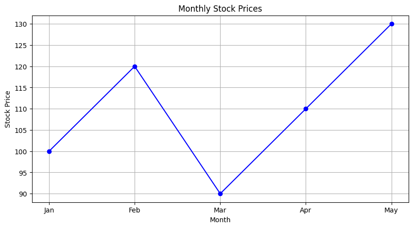
Line graphs are commonly used in finance to track price movements over time. The x-axis represents time, while the y-axis represents the price or value of a financial instrument. By connecting data points with lines, line graphs illustrate the changes in price over a specific period. Line graphs are widely used to analyze stock prices, exchange rates, and other financial metrics.import matplotlib.pyplot as plt
# Sample data
months = [‘Jan’, ‘Feb’, ‘Mar’, ‘Apr’, ‘May’]
stock_prices = [100, 120, 90, 110, 130]
# Generating the line graph
plt.figure(figsize=(10, 5))
plt.plot(months, stock_prices, marker=’o’, linestyle=’-‘, color=’b’)
plt.title(‘Monthly Stock Prices’)
plt.xlabel(‘Month’)
plt.ylabel(‘Stock Price’)
plt.grid(True)
plt.show()
2. Bar graphs
Bar graphs are effective for comparing values across different categories. In finance, bar graphs are often used to visualize market share, revenue, or performance of different companies or sectors. Each bar represents a specific category, and the height of the bar corresponds to the value or quantity being measured. Bar graphs provide a straightforward way to compare data and identify trends or outliers.import matplotlib.pyplot as plt
# Sample data
quarters = [‘Q1’, ‘Q2’, ‘Q3’, ‘Q4’]
portfolio_returns = [5.5, 7.2, -3.4, 4.8]
# Generating the bar graph
plt.figure(figsize=(10, 5))
plt.bar(quarters, portfolio_returns, color=’green’)
plt.title(‘Quarterly Portfolio Returns’)
plt.xlabel(‘Quarter’)
plt.ylabel(‘Returns (%)’)
plt.grid(axis=’y’)
plt.show()

3. Candlestick charts
Candlestick charts are commonly used for technical analysis in finance. They provide detailed information about price movements and volume patterns within a given period. Each candlestick on the chart represents the price range and trading activity during that period. The body of the candle illustrates the opening and closing prices, while the upper and lower lines, called wicks or shadows, show the highest and lowest prices reached during the period. Candlestick charts help traders and analysts identify trends, reversals, and potential trading opportunities.import plotly.graph_objects as go
import pandas as pd
# Sample data: Date, Open, High, Low, Close
data = {
‘Date’: pd.date_range(start=’2024-01-01′, periods=5, freq=’D’),
‘Open’: [100, 105, 103, 108, 107],
‘High’: [110, 108, 106, 112, 109],
‘Low’: [95, 102, 101, 105, 106],
‘Close’: [105, 107, 104, 110, 108],
}
df = pd.DataFrame(data)
# Creating the candlestick chart
fig = go.Figure(data=[go.Candlestick(x=df[‘Date’],
open=df[‘Open’], high=df[‘High’],
low=df[‘Low’], close=df[‘Close’],
increasing_line_color=’green’, decreasing_line_color=’red’)])
fig.update_layout(title=’Candlestick Chart’, xaxis_title=’Date’, yaxis_title=’Price’)
fig.show()
Overall, financial graphs play a crucial role in understanding and interpreting financial data. By utilizing line graphs, bar graphs, and candlestick charts, investors, analysts, and finance professionals can make informed decisions and gain valuable insights into market trends and patterns.
Advanced Python Libraries for Financial Graphs
When it comes to visualizing financial data, Python offers several powerful libraries that can help create professional and interactive financial graphs. These libraries provide a wide range of customization options and functionalities, catering to the specific needs of financial analysts and professionals. Here are three advanced Python libraries that stand out for their capabilities in generating financial graphs:
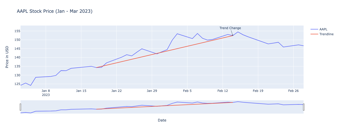
Plotly: Plotly is a popular library that allows developers to create interactive and dynamic financial graphs. With its intuitive interface, plotting various types of financial data becomes seamless. Plotly supports a variety of chart types, including line, scatter, bar, and candlestick charts. Its robust functionality enables the addition of annotations, trendlines, and various technical indicators to the graphs. Furthermore, Plotly graphs can be easily shared, embedded, and even published online.import plotly.graph_objects as go
import yfinance as yf
# Fetch data
aapl_data = yf.download(‘AAPL’, start=’2023-01-01′, end=’2023-03-01′)
aapl_data.reset_index(inplace=True)
# Plot
fig = go.Figure()
# Adding the stock price line
fig.add_trace(go.Scatter(x=aapl_data[‘Date’], y=aapl_data[‘Adj Close’], mode=’lines’, name=’AAPL’))
# Adding a trendline example
fig.add_trace(go.Scatter(x=[aapl_data[‘Date’].iloc[10], aapl_data[‘Date’].iloc[-10]],
y=[aapl_data[‘Adj Close’].iloc[10], aapl_data[‘Adj Close’].iloc[-10]],
mode=’lines’, name=’Trendline’))
# Adding annotations
fig.add_annotation(x=aapl_data[‘Date’].iloc[-10], y=aapl_data[‘Adj Close’].iloc[-10],
text=”Trend Change”,
showarrow=True,
arrowhead=1)
fig.update_layout(title=’AAPL Stock Price (Jan – Mar 2023)’,
xaxis_title=’Date’,
yaxis_title=’Price in USD’,
xaxis_rangeslider_visible=True)
fig.show()
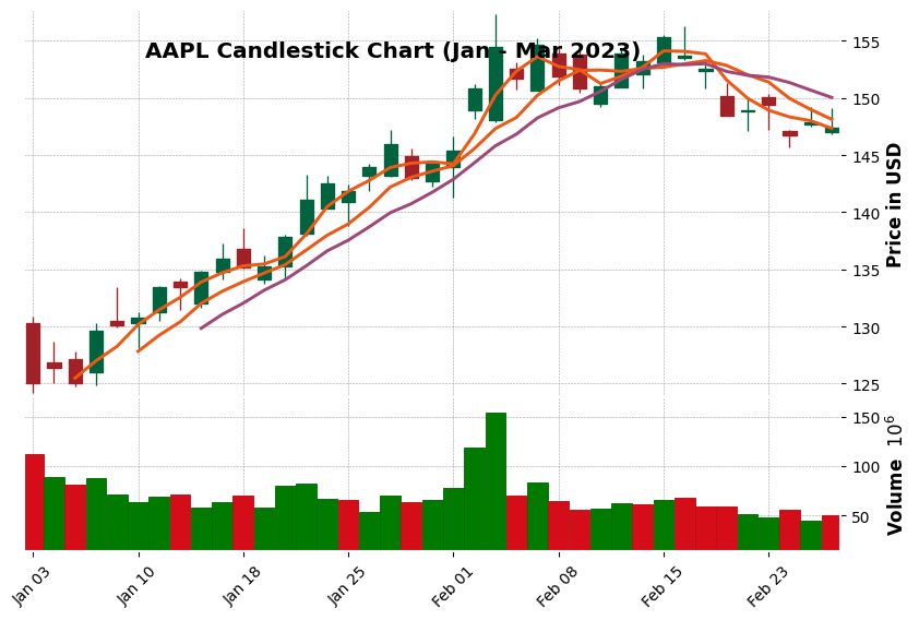
mplfinance: mplfinance, also known as Matplotlib Finance, specializes in visualizing candlestick charts — widely used to represent stock price movements over time. This library provides a simple and straightforward API for generating candlestick charts with customization options. mplfinance supports multiple plot styles, allowing users to choose from classic, candle, line, ohlc, and more. Additionally, it offers various customizations, such as color schemes, plot sizes, and annotation overlays. mplfinance integrates well with Matplotlib and Pandas, making it a versatile choice for financial graphing.import mplfinance as mpf
import yfinance as yf
# Fetch data
aapl_data = yf.download(‘AAPL’, start=’2023-01-01′, end=’2023-03-01′)
# Candlestick chart
mpf.plot(aapl_data, type=’candle’, style=’charles’,
title=’AAPL Candlestick Chart (Jan – Mar 2023)’,
ylabel=’Price in USD’,
volume=True,
mav=(3,6,9), # Moving averages
figratio=(12,8),
tight_layout=True)
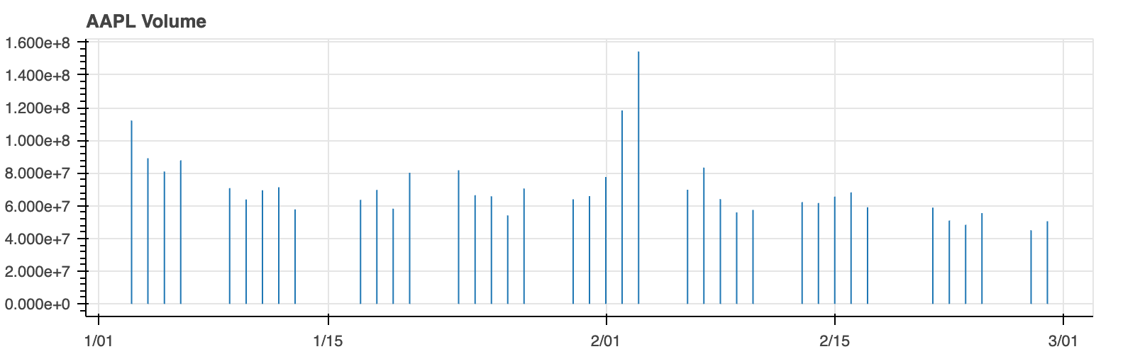
Bokeh: Bokeh is a powerful library for building interactive financial dashboards. Its primary focus is on creating rich and engaging data visualizations for web browsers. Bokeh provides a variety of financial chart types, including line, bar, area, and scatter plots, catering to different data visualization needs. Its interactivity features allow users to explore and interact with the financial data directly in the browser, making it a valuable tool for data exploration and analysis. Bokeh also offers advanced features like linked brushing and server-based deployment.from bokeh.plotting import figure, show, output_notebook # Import output_notebook
from bokeh.models import ColumnDataSource
from bokeh.layouts import column
import yfinance as yf
# Ensure plots render in the Jupyter notebook
output_notebook()
# Fetch data
aapl_data = yf.download(‘AAPL’, start=’2023-01-01′, end=’2023-03-01′)
aapl_data.reset_index(inplace=True)
source = ColumnDataSource(aapl_data)
# Line chart for closing prices
p1 = figure(width=800, height=250, title=’AAPL Closing Prices’, x_axis_type=’datetime’)
p1.line(‘Date’, ‘Adj Close’, source=source)
# Volume chart
p2 = figure(width=800, height=250, title=’AAPL Volume’, x_axis_type=’datetime’, x_range=p1.x_range)
p2.vbar(‘Date’, top=’Volume’, source=source, width=0.9)
# Linking both charts
layout = column(p1, p2)
show(layout)

These advanced Python libraries — Plotly, mplfinance, and Bokeh — provide a wealth of options for visualizing financial data. Each library has its own strengths and unique features, allowing users to choose the one that best suits their requirements. By leveraging these libraries, financial analysts and professionals can create visually appealing and informative graphs to convey complex financial information effectively.
Strategies for Analyzing Financial Graphs
Analyzing financial graphs is crucial for making informed investment decisions. Here are two key strategies for effectively analyzing financial graphs:
Identifying Trends, Support, and Resistance Levels
Recognizing trends is essential in understanding the overall direction of a financial asset’s price movement. This can be done by visually inspecting the graph and identifying patterns such as uptrends, downtrends, or sideways trends. Additionally, it is important to identify support and resistance levels, which are price levels where the asset tends to find support or encounter resistance.
Support Levels: These are price levels where the demand for the asset is strong enough to prevent it from falling further. Traders and investors often consider buying or accumulating the asset at these levels, believing that it will bounce back.
Resistance Levels: On the other hand, resistance levels are price levels where the selling pressure outweighs the buying pressure, preventing the asset from rising further. Traders and investors may consider selling or taking profit when the asset approaches these levels.
By identifying trends, support, and resistance levels, traders can make more informed decisions on when to buy, sell, or hold an asset.
Using Moving Averages and Technical Indicators
Moving averages and technical indicators are essential tools for analyzing financial graphs. They provide valuable insights into the overall trend, momentum, and potential reversal points of an asset.
Moving Averages: Moving averages smooth out price data by calculating the average price over a specific period. They help identify the overall trend and indicate support and resistance levels. Commonly used moving averages include the 50-day moving average (short-term trend) and the 200-day moving average (long-term trend).
Technical Indicators: These mathematical calculations are applied to financial graphs to generate trading signals and provide insights into market conditions. Examples of technical indicators include the Relative Strength Index (RSI), Moving Average Convergence Divergence (MACD), and Bollinger Bands. Traders use these indicators to identify overbought or oversold conditions, trend reversals, or potential buying and selling opportunities.
By incorporating moving averages and technical indicators into financial graph analysis, traders can gain a deeper understanding of market trends and potential entry or exit points.
In summary, effective analysis of financial graphs requires the identification of trends, support, and resistance levels, as well as the use of moving averages and technical indicators. By utilizing these strategies, traders and investors can make more informed decisions and increase their chances of success in the financial markets.
Case Studies: Python Financial Graphs in Action
Python is a powerful programming language that offers various libraries and tools for financial data analysis and visualization. Here are three real-world case studies that demonstrate the use of Python to create financial graphs for different purposes.
1. Stock price analysis and forecasting
Python’s data visualization libraries, such as Matplotlib and Seaborn, can be utilized to analyze and visualize historical stock prices. By plotting the stock price data on a line graph, you can identify trends, patterns, and potential correlations. Additionally, you can use regression techniques and time series forecasting models, such as ARIMA or LSTM, to predict future stock prices.
2. Portfolio performance visualization
Python can also be used to track and visualize the performance of an investment portfolio. By retrieving historical data for each asset in the portfolio, you can calculate the portfolio’s cumulative returns, standard deviation, and other performance metrics. Plotting these metrics on a bar or line graph allows for a visual representation of how the portfolio has performed over time. This visualization helps investors make informed decisions and adjust their investment strategies accordingly.
3. Options trading strategies using volatility charts
Python can be leveraged to analyze options trading strategies using volatility charts. Volatility, a crucial factor in options pricing, can be calculated using historical stock price data. By plotting volatility charts using libraries like Plotly or mplfinance, traders can identify periods of high or low volatility and adjust their options trading strategies accordingly. These visualizations provide valuable insights into potential profit opportunities and risk management.
By utilizing Python’s vast range of financial libraries and tools, analysts and traders can create visually appealing and informative financial graphs for various purposes. These graphs not only enhance data analysis but also facilitate decision-making processes in the financial domain.
Data Sources and API Integration for Real-Time Financial Data
The ability to access and integrate real-time financial data is crucial for businesses and individuals seeking up-to-date information for analysis and decision-making. In this section, we will explore how to retrieve financial data using APIs and integrate it into Python for analysis. We will also discuss how to leverage APIs to automate data retrieval and generate real-time graphs.
Accessing and Integrating Financial Data into Python
When it comes to accessing financial data, there are various data sources and APIs available. Some popular sources include:
- Yahoo Finance: Yahoo Finance offers a wide range of financial data, including historical price data, dividend information, and company financials. You can access this data using the Yahoo Finance API or by web scraping.
- Alpha Vantage: Alpha Vantage provides real-time and historical financial data. They offer a comprehensive API that allows you to access various data points, such as stock quotes, technical indicators, and sector performances.
- Quandl: Quandl is a platform that offers a vast collection of financial, economic, and alternative data. They provide an API that allows you to retrieve and integrate this data into your Python code.
To integrate financial data into Python, you can use libraries like pandas and numpy to handle data manipulation and analysis. These libraries provide functions and data structures that simplify working with financial data.
To retrieve data from APIs, you can use Python libraries such as requests or dedicated packages like yfinance, which provides an easy-to-use interface for accessing Yahoo Finance data. Additionally, many APIs require an API key for authentication, so make sure to sign up and obtain the necessary credentials before proceeding.import yfinance as yf
import plotly.graph_objects as go
# Fetching real-time data for Apple Inc. over the last 60 days
ticker_symbol = ‘AAPL’
ticker_data = yf.Ticker(ticker_symbol)
ticker_df = ticker_data.history(period=’60d’) # Adjust period as needed
# Plotting the data using Plotly
fig = go.Figure()
fig.add_trace(go.Scatter(x=ticker_df.index, y=ticker_df[‘Close’], mode=’lines’, name=ticker_symbol))
fig.update_layout(
title=f’Real-Time Closing Prices for {ticker_symbol} – Last 60 Days’,
xaxis_title=’Date’,
yaxis_title=’Price (USD)’,
xaxis_rangeslider_visible=True # This adds a range slider below the chart
)
fig.show()

Tips and Best Practices for Creating Engaging Financial Graphs
Creating engaging financial graphs is crucial for effectively communicating data and insights. By following these tips and best practices, you can ensure that your graphs are visually appealing, informative, and easy for your audience to understand.
Choosing the Right Graph Type for Specific Data Patterns
The first step in creating engaging financial graphs is selecting the appropriate graph type based on the data patterns you want to represent. Here are a few common graph types used in finance:
- Line Graphs: Line graphs are ideal for tracking changes over time. They are often used to display trends in stock prices, portfolio performance, or economic indicators.
- Bar Graphs: Bar graphs are useful for comparing values between different categories. They are commonly used to compare financial performance across multiple companies or to show the distribution of revenue by product category.
- Pie Charts: Pie charts are effective for showing the composition of a whole. They are frequently used to illustrate the allocation of investment portfolios or market share percentages.
- Scatter Plots: Scatter plots are helpful for examining the relationship between two variables. They can be used to analyze the correlation between stock prices and trading volume, for example.
When choosing a graph type, consider the data patterns you want to highlight and select the one that best represents and emphasizes those patterns.
Enhancing Graphs with Annotations, Colors, and Legends
To make your financial graphs more engaging and visually appealing, consider the following techniques:
- Annotations: Use annotations to provide additional context or highlight specific data points. Add labels, arrows, and text boxes to draw attention to important observations or trends. Annotations can help your audience understand the significance of the data and make your graphs more informative.
- Colors: Utilize colors effectively to enhance the visual appeal of your graphs. Choose a color scheme that is visually pleasing and easy to interpret. Use different colors to distinguish between categories or data series. However, ensure that the colors you choose are distinguishable for viewers who may have color vision deficiencies.
- Legends: Include a legend to clearly explain the meaning of different colors or symbols used in your graphs. This will prevent any confusion and make it easier for your audience to understand the data being presented.
- Formatting and Style: Pay attention to the overall formatting and style of your graphs. Ensure that the font size is legible, axis labels are clearly visible, and gridlines are appropriately used. Consistency in design elements across multiple graphs can also add to the visual appeal and coherence of your presentations.
By applying these tips and best practices, you can create engaging financial graphs that effectively communicate data and insights to your audience. Remember to keep your graphs visually appealing, informative, and easy to interpret to maximize their impact.
Future Trends in Financial Graphing with Python
As the financial industry evolves, new technologies and methodologies are continuously being integrated into financial graphing. Python, with its versatility and powerful libraries, is becoming increasingly popular for creating and analyzing financial visualizations. In the future, we can expect the following trends to shape the field of financial graphing using Python:
Machine Learning Integration for Pattern Recognition
One of the significant advancements in financial graphing is the integration of machine learning algorithms for pattern recognition. Python libraries like scikit-learn and TensorFlow provide a robust foundation for training models that can identify complex patterns and trends in financial data. By leveraging machine learning, analysts can discover hidden insights and make more accurate predictions, enhancing their decision-making capabilities.
Machine learning algorithms can identify specific trends in financial data that are difficult to recognize with traditional graphing techniques. With Python’s extensive machine learning ecosystem, analysts can develop models that automatically detect patterns, such as stock market cycles or recurring trading patterns. This integration of machine learning into financial graphing enables investors and traders to identify opportunities and make informed decisions.
Virtual Reality and Augmented Reality Applications in Financial Visualization
Another emerging trend in financial graphing is the integration of virtual reality (VR) and augmented reality (AR) technologies. Python libraries like Unity and Pygame enable the creation of immersive graphical experiences. In the future, financial professionals may utilize VR and AR to visualize complex financial data in a more intuitive and interactive manner.
VR and AR can help analysts view financial data in three-dimensional space, allowing for better comprehension of complex relationships between variables. For example, users can navigate through visualized stock market data and interactively explore historical trends. This immersive experience can provide deeper insights and enable faster decision-making.
Additionally, VR and AR can be utilized for financial education and training purposes. Traders and investors can simulate real-world scenarios in virtual environments, allowing them to practice their decision-making skills in a risk-free setting. Python’s compatibility with VR and AR frameworks makes it a versatile tool for developers and analysts in the financial industry.
In conclusion, the future of financial graphing with Python holds exciting possibilities. The integration of machine learning algorithms for pattern recognition and the utilization of VR and AR technologies are just a couple of the trends that will shape the field. As Python continues to evolve as a powerful tool for financial visualization, professionals in the industry can expect more innovative and insightful ways to graph and analyze financial data.
Conclusion: Unlocking Insights with Python Financial Graphs
In this article, we delved into the world of Python financial graphs and explored the various concepts and techniques that empower finance professionals with advanced data visualization tools. By harnessing the power of Python libraries such as Matplotlib, Plotly, and Seaborn, finance professionals can unlock valuable insights from complex financial data.
Throughout the article, we discussed the importance of data visualization in the finance industry and how Python can facilitate the creation of visually appealing and informative graphs. We explored different graph types such as line graphs, bar graphs, and scatter plots, and highlighted their relevance in analyzing trends, comparing data, and presenting financial information effectively.
We also emphasized the significance of customization in financial graph creation. With Python, finance professionals can customize graph elements such as axes, labels, colors, and legends, allowing them to tailor their visualizations to specific requirements and enhance clarity and readability.
Moreover, we touched on the importance of data preprocessing and handling missing values before plotting financial graphs. Python offers various techniques for data cleaning and preprocessing, ensuring accurate and reliable visual representations of financial data.
By utilizing Python financial graphs, finance professionals can gain a deeper understanding of key financial metrics, identify patterns and trends, and make data-driven decisions. These visualizations empower them to effectively communicate complex financial information to stakeholders, aiding in strategic planning, performance analysis, risk assessment, and investment decision-making.
In conclusion, Python financial graphs provide finance professionals with a powerful toolset to unlock insights from complex financial data. By integrating data visualization techniques into their workflow, finance professionals can enhance their analytical capabilities and make informed decisions that drive business success in today’s dynamic financial landscape.
References: