
The Fascinating World of Rare Plots
Data visualization plays a crucial role in data analysis, enabling us to make sense of complex information and identify patterns and trends. By presenting data in a visual format, we can explore and interpret it more effectively, leading to valuable insights and informed decision-making.
One area of data visualization that has gained significant attention is rare plots. These visually captivating representations allow us to uncover hidden insights and outliers within datasets that may otherwise go unnoticed. Rare plots offer a unique perspective on data, highlighting rare occurrences, anomalies, and extreme values that hold immense value in various fields, from finance to healthcare and beyond.
In this article, we will explore the allure of rare plots and delve into their importance in uncovering hidden insights. Through detailed examples and analysis, we will showcase how rare plots can enhance our understanding of data and facilitate informed decision-making. So, let’s embark on this fascinating journey into the world of rare plots and discover their remarkable potential.
Scatterplot Transformations: Beyond Linear Relationships
Scatterplot transformations offer a powerful way to visualize and explore relationships that go beyond linear trends. These transformations help uncover exponential relationships, handle dense data points, and examine cyclic and directional patterns. Let’s delve into three common scatterplot transformations:
1. Logarithmic Scatterplots: Unveiling Exponential Relationships
Logarithmic scatterplots are used when the relationship between variables follows an exponential pattern. By taking the logarithm of one or both variables, the plot compresses the data, making it easier to discern patterns in the exponential relationship.
When plotting data on a logarithmic scale, the x-axis and/or y-axis represent the logarithm of the original values. This transformation allows for a more accurate representation of the data, especially when there is a wide range of values.
import matplotlib.pyplot as plt
import numpy as np

# Generate sample data
x = np.linspace(1, 10, 100)
y = np.exp(x)

plt.scatter(x, y)
plt.xscale('log')
plt.yscale('log')
plt.title('Logarithmic Scatterplot')
plt.xlabel('Log(X)')
plt.ylabel('Log(Y)')
plt.show()
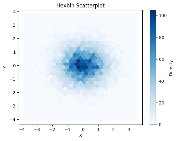
2. Hexbin Scatterplots: Visualizing Dense Data Points
Hexbin scatterplots are especially useful when dealing with large datasets containing many overlapping data points. Instead of displaying individual data points, hexbin scatterplots divide the plot area into hexagonal bins and assign a color or shading to represent the density of points within each bin. This visualization technique helps to identify regions of high density and reveal underlying patterns that might be obscured with traditional scatterplots.
Hexbin scatterplots are particularly effective for visualizing spatial data or when working with datasets that contain a high degree of overlap and clustering.
import matplotlib.pyplot as plt
import numpy as np
x = np.random.randn(10000)
y = np.random.randn(10000)
plt.hexbin(x, y, gridsize=30, cmap=’Blues’)
cb = plt.colorbar(label=’Density’)
plt.xlabel(‘X’)
plt.ylabel(‘Y’)
plt.title(‘Hexbin Scatterplot’)
plt.show()
3. Polar Scatterplots: Exploring Cyclic Patterns and Directional Relationships
Polar scatterplots are best suited for data that exhibits cyclical patterns or relationships with a directional component. By plotting data in polar coordinates, each data point corresponds to a specific angle and distance from the origin.
This transformation allows for a clear visual representation of the cyclic or directional relationships. It is particularly useful when analyzing data such as wind directions, seasons, or circular patterns.
By utilizing scatterplot transformations such as logarithmic scatterplots, hexbin scatterplots, and polar scatterplots, data analysts can gain deeper insights and uncover valuable patterns that may not be apparent with traditional linear scatterplots.
import matplotlib.pyplot as plt
import numpy as np
r = np.random.rand(100)
theta = 2 * np.pi * r
plt.subplot(111, polar=True)
plt.scatter(theta, r)
plt.title(‘Polar Scatterplot’)
plt.show()

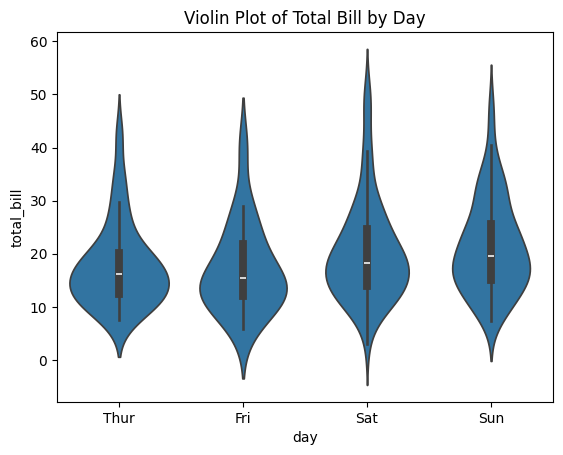
Violin Plots: Unveiling Distributions and Multimodal Data
Violin plots are powerful visualizations that provide insights into the distribution of data and reveal multimodal patterns. They combine the characteristics of box plots and kernel density plots to effectively convey information about the data’s central tendency, spread, and skewness.
1. Understanding the Anatomy of Violin Plots
A violin plot consists of several elements:
- Violin Body: The main component of a violin plot is the “body,” which represents the distribution of the data. It is symmetrical along the vertical axis and possesses variable width. The width of the violin represents the density of data points at different values. Wider sections indicate areas of higher data density, while narrower sections indicate areas of lower density.
- Kernel Density Plot: Violin plots often contain a kernel density plot inside the violin body. This plot provides a smooth estimate of the distribution of the data. The peaks of the kernel density plot indicate modes in the data distribution.
- Box Plot: A box plot is typically superimposed on the violin body. It displays the quartiles (25th, 50th, and 75th percentiles) as a rectangular box, with a line or symbol inside representing the median. The whiskers extend from the box to the minimum and maximum values within a certain range.
- Outliers: Outliers, if present, are demonstrated as individual points beyond the whiskers of the box plot. They indicate data points that are significantly different from the rest of the distribution.
2. Using Violin Plots to Compare Distributions across Different Groups or Categories
One of the primary applications of violin plots is the comparison of distributions across different groups or categories. Violin plots allow quick visualization and comparison of the shapes and spreads of various data distributions.
By plotting multiple violin plots together, you can observe how the distributions differ across different groups. This visual comparison helps identify any differences in medians, spreads, skewness, or multimodality between the groups.
3. Visualizing the Combination of Violin and Scatterplots for Rich Insights
To gain richer insights, violin plots can be combined with scatterplots. This combination enables the display of individual data points within each category or group, adding granularity to the distribution visualization.
By incorporating scatterplots into violin plots, you can visualize the relationship between individual data points and the overall distribution. This allows you to observe specific data patterns within each category or group, identify potential outliers, and detect associations that may not be apparent in the distribution alone.
In conclusion, violin plots are powerful tools for understanding distributions and revealing multimodal patterns in data. They provide a comprehensive visualization of data distributions while allowing for comparison across groups and the integration of individual data points through scatterplots. Adding violin plots to your visual analytics toolkit can enhance your ability to uncover meaningful insights and patterns in your data.
import seaborn as sns
import matplotlib.pyplot as plt
# Sample data
tips = sns.load_dataset(“tips”)
sns.violinplot(x=”day”, y=”total_bill”, data=tips)
plt.title(‘Violin Plot of Total Bill by Day’)
plt.show()
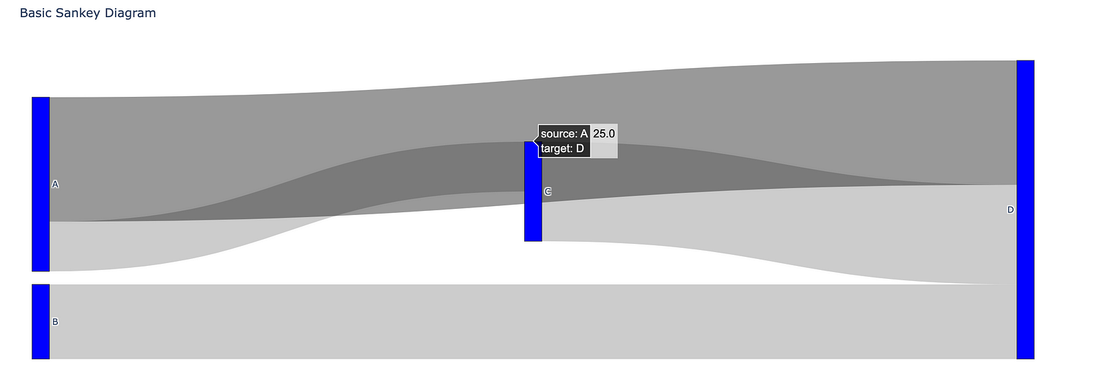
Sankey Diagrams: Mapping Flow and Relationships
Sankey diagrams are powerful visual tools that represent the flow and relationships between different entities or concepts. These diagrams often utilize arrows or lines with varying thicknesses to depict the magnitude of the flow. They are popularly used in various fields to analyze complex systems and visualize data in a clear and concise manner. In this section, we will explore the structure and components of Sankey diagrams, their applications in analyzing energy flow, migration patterns, and more, and how they are used in real-world scenarios like business and public policy.
1. Exploring the Structure and Components of Sankey Diagrams
Sankey diagrams consist of several fundamental components:
- Nodes: Nodes in a Sankey diagram represent entities or categories. They can be anything from energy sources and destinations to countries or products.
- Flows: Flows visually represent the magnitude of the relationship or transition between nodes. The thickness of the flow is proportional to the quantity being represented, such as energy flow or migration numbers. Flows can also be directional, indicating the movement from one node to another.
- Labels: Labels provide additional information about the nodes and flows, such as the specific value or percentage represented by a flow or the name of the node.
- Colors: Colors are used to differentiate nodes and flows, making it easier to identify and understand the relationships between different entities.
Understanding the structure and components of a Sankey diagram is crucial to correctly interpreting and analyzing the information presented.
2. Using Sankey Diagrams to Analyze Energy Flow, Migration Patterns, and More
Sankey diagrams have diverse applications across various fields. They are particularly useful in analyzing complex systems with multiple interconnected components. Here are some popular applications of Sankey diagrams:
a. Energy Flow Analysis: Sankey diagrams are commonly used to visualize energy flow and consumption patterns in different sectors. They can represent the transformation of energy from different sources, such as fossil fuels, renewable energy, and electricity, to end-use sectors like transportation, residential, and industrial.
b. Migration Patterns: Sankey diagrams can depict migration flows between different regions or countries. They help visualize the movement of people, the origin, and destination regions, and the volume of migration.
c. Material Flow Analysis: Sankey diagrams are also used to analyze material flows in industrial processes. They provide insights into the sources, uses, and losses of different materials, helping identify opportunities for resource optimization and waste reduction.
d. Water Distribution: Sankey diagrams aid in understanding and managing water distribution systems. They illustrate the flow of water from sources such as rivers or reservoirs to end-users like households, industries, and agriculture.
e. Data Visualization: Sankey diagrams are employed to represent complex data in a visually appealing and easy-to-understand format. They are widely used in data visualization projects to display relationships and connections between different data points.
3. Real-World Applications of Sankey Diagrams in Business and Public Policy
Sankey diagrams have practical applications in various real-world scenarios, including business and public policy:
a. Supply Chain Analysis: Businesses utilize Sankey diagrams to analyze supply chains, mapping the flow of materials, resources, and information. This helps identify bottlenecks, optimize processes, and reduce waste.
b. Environmental Impact Assessment: Sankey diagrams are used to assess the environmental impact of manufacturing processes, transportation systems, or energy production. They provide a comprehensive view of resource usage, emissions, and waste generation, aiding in the development of sustainable strategies and policies.
c. Urban Planning: Sankey diagrams assist urban planners in understanding and optimizing the flow of resources and services within cities. They provide insights into energy consumption, transportation patterns, and waste management, contributing to the development of sustainable urban environments.
d. Policy Development: Sankey diagrams are employed by policymakers to visualize complex policy issues, facilitating data-driven decision-making. They help understand the effects of policies on different sectors and identify potential trade-offs or opportunities.
Sankey diagrams offer a versatile visualization tool that can be applied to numerous scenarios across various domains. By enabling a comprehensive understanding of flow and relationships, they facilitate informed decision-making and enhance communication of complex concepts or data.
import plotly.graph_objects as go
fig = go.Figure(data=[go.Sankey(
node=dict(
pad=15,
thickness=20,
line=dict(color=”black”, width=0.5),
label=[“A”, “B”, “C”, “D”],
color=”blue”
),
link=dict(
source=[0, 1, 0, 2], # indices correspond to labels, eg A, B, A, C
target=[2, 3, 3, 3],
value=[10, 15, 25, 20]
))])
fig.update_layout(title_text=”Basic Sankey Diagram”, font_size=10)
fig.show()
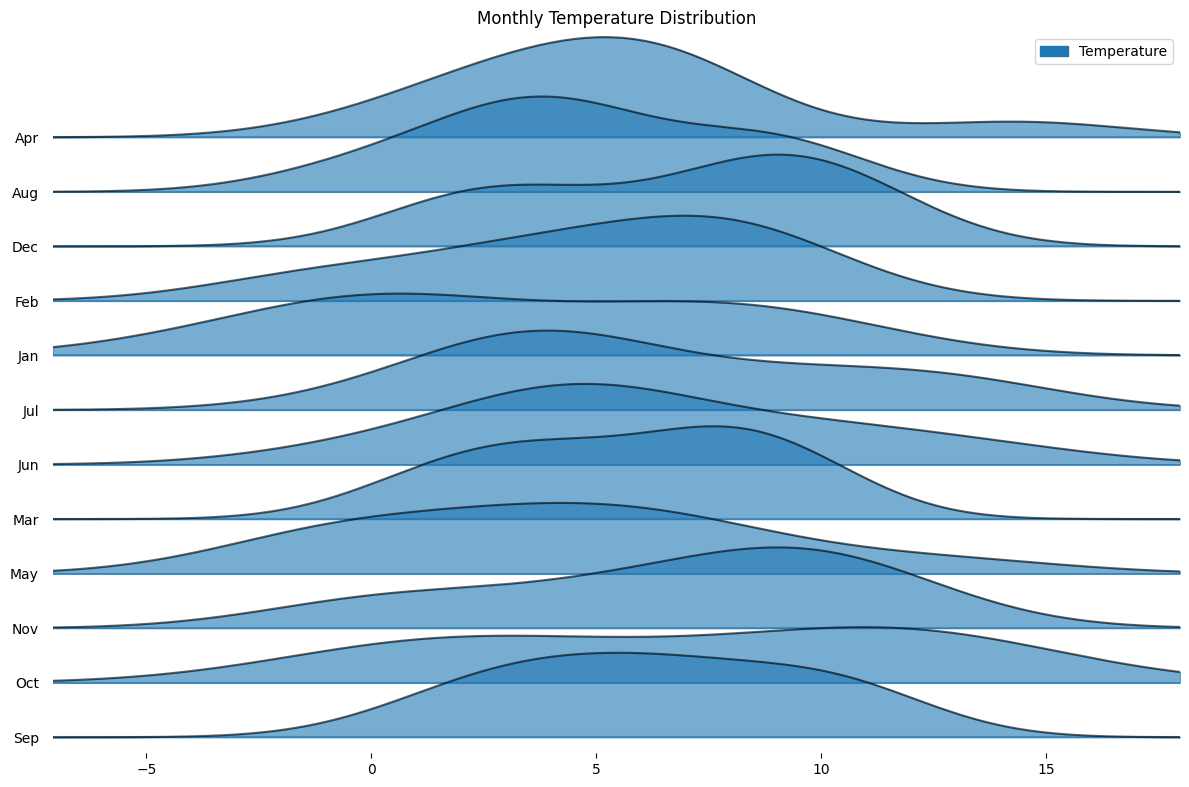
Joy Plots: Capturing Changes and Variability Over Time
Joy plots are a visualization technique that offers a unique representation of data trends and variations over time. By depicting the density of multiple data distributions, joy plots provide a clearer understanding of how variables change and fluctuate across different time periods. This article will explore the concept of joy plots, their applications, and their usefulness in various domains.
1. Introduction to Joy Plots and their Unique Visual Representation
Joy plots, also known as ridgeline plots, display the density of a variable along the y-axis against time or another continuous variable on the x-axis. These plots enable the visualization of changes in data distribution and allow for the comparison of different data sets. By stacking the densities of multiple variables, joy plots provide a comprehensive visual representation of the variability and patterns in the data.
The uniqueness of joy plots lies in their ability to show the density curves in close proximity, making it easier to identify shifts in distribution and explore the overall trends. Rather than using traditional line plots or bar charts, joy plots offer a more intuitive and compact depiction of data changes over time.
2. Analyzing Trends and Variations using Joy Plots
Joy plots excel in capturing and analyzing trends and variations in data. The overlapping density curves in a joy plot provide insights into the distribution pattern and enable the identification of different modes or peaks. By observing the changes in these peaks over time, analysts can infer shifts in the underlying data distributions.
Furthermore, joy plots allow for the exploration of within-group variations and between-group comparisons. The varying width of the density curves represents the spread or variability in the data at different time points. By comparing the widths of different distributions, analysts can assess the relative levels of variability across different periods.
3. Applying Joy Plots in Various Domains, such as Finance and Climate Data Analysis
Joy plots find applications in various domains, including finance, climate data analysis, and many others. In finance, joy plots can be used to analyze stock prices, portfolio performance, or market trends. By visualizing the density of stock prices or returns over time, analysts can spot periods of high volatility, identify market trends, and assess the performance of different assets or portfolios.
In climate data analysis, joy plots can help examine variables like temperature, precipitation, or sea-level rise. By plotting the density of these variables along time, scientists can analyze the changes in climate patterns, detect anomalies, and investigate long-term trends.
These are just a few examples of the wide-ranging applications of joy plots. With their ability to capture changes and variability over time, joy plots are a valuable tool for analyzing data and gaining deeper insights in various fields.import pandas as pd
import matplotlib.pyplot as plt
from joypy import joyplot
# Sample data: Temperature distributions for different months
data = {
‘Month’: [‘Jan’, ‘Feb’, ‘Mar’, ‘Apr’, ‘May’, ‘Jun’, ‘Jul’, ‘Aug’, ‘Sep’, ‘Oct’, ‘Nov’, ‘Dec’] * 10,
‘Temperature’: (
list(np.random.normal(0, 2, size=10)) +
list(np.random.normal(1, 2, size=10)) +
list(np.random.normal(2, 2, size=10)) +
list(np.random.normal(3, 2, size=10)) +
list(np.random.normal(4, 2, size=10)) +
list(np.random.normal(5, 2, size=10)) +
list(np.random.normal(6, 2, size=10)) +
list(np.random.normal(7, 2, size=10)) +
list(np.random.normal(8, 2, size=10)) +
list(np.random.normal(9, 2, size=10)) +
list(np.random.normal(10, 2, size=10)) +
list(np.random.normal(11, 2, size=10))
)
}
df = pd.DataFrame(data)
# Creating the Joy Plot
fig, axes = joyplot(
data=df,
by=’Month’,
column=’Temperature’,
figsize=(12, 8),
legend=True,
alpha=0.6,
title=’Monthly Temperature Distribution’
)
plt.show()
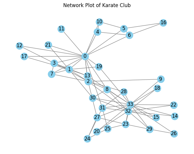
Network Plots: Revealing Complex Relationships
Network plots, also known as network graphs or network visualizations, are powerful tools for analyzing and understanding complex relationships in various domains. This article explores the different components of network graphs and their applications in analyzing social networks, web graphs, and co-authorship networks. Additionally, it discusses how network plots can be used for anomaly detection and identifying influential nodes.
1. Introduction to network graphs and their components
Network graphs consist of nodes, which represent entities, and edges, which represent the connections or relationships between these entities. The visual representation of a network graph helps to reveal the patterns and structures within the network.
Nodes:
Nodes in a network graph can represent individuals, organizations, websites, or any other entity of interest. Each node can have attributes such as a name, label, or various other properties.
Edges:
Edges connect pairs of nodes and represent the relationships or interactions between them. Edges can be directed or undirected, weighted or unweighted, and can have different types or labels.
Attributes:
Network graphs can also include additional attributes, such as node size, node color, or edge thickness. These attributes can provide further information about the nodes, edges, or their relationships.
import networkx as nx
import matplotlib.pyplot as plt
G = nx.karate_club_graph()
pos = nx.spring_layout(G)
nx.draw(G, pos, with_labels=True, node_color=’skyblue’, edge_color=’gray’)
plt.title(‘Network Plot of Karate Club’)
plt.show()
2. Analyzing social networks, web graphs, and co-authorship networks
Network plots are extensively used to analyze various types of networks, including:
Social Networks:
Social network analysis involves studying the relationships and interactions between individuals or groups. By visualizing social networks as network plots, researchers can gain insights into communication patterns, influence dynamics, community structures, and information diffusion within social systems.
Web Graphs:
Web graphs represent the structure of the World Wide Web, with webpages as nodes and hyperlinks as edges. Analyzing web graphs helps researchers understand the connectivity patterns, importance of webpages, and the effectiveness of web crawling algorithms.
Co-authorship Networks:
Co-authorship networks showcase the collaboration patterns among researchers and scientists. Network plots can help identify key researchers, research communities, and the flow of knowledge within a scientific field.
3. Using network plots for anomaly detection and identifying influential nodes
Network plots can also be used for anomaly detection and identifying influential nodes within a network.
Anomaly Detection:
By visualizing a network plot, researchers can identify nodes or edges that deviate from the expected patterns. These anomalies may represent fraudulent activities, outliers, or unusual behaviors within the network.
Identifying Influential Nodes:
Network plots can help identify nodes that have a significant impact on the overall network dynamics. These influential nodes can play a vital role in information propagation, decision-making, or controlling the flow of resources within the network.
In conclusion, network plots provide a visual representation of complex relationships and are valuable tools for analyzing social networks, web graphs, and co-authorship networks. They can be used for anomaly detection and identifying influential nodes within a network. By leveraging network plots, researchers and analysts can gain valuable insights and make informed decisions in various domains.
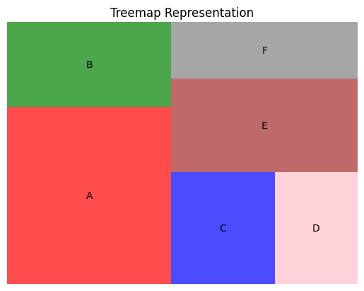
Treemaps: Visualizing Hierarchical Data
Treemaps are an effective visualization technique for representing hierarchical data. They provide a concise and informative overview of the structure, properties, and relationships within complex datasets. In this section, we will explore the key aspects of treemaps and their applications in different domains.
1. Understanding the Structure and Properties of Treemaps
Treemaps are graphical representations of hierarchical data that use nested rectangles to illustrate the relationships between parent and child nodes. Each rectangle represents a data element, and its size and color are used to convey additional information.
Nested Rectangles: The main feature of treemaps is the representation of data elements as nested rectangles. The size of each rectangle represents the value or weight of the corresponding data element. The parent-child relationships in the hierarchy are shown through the placement of rectangles within larger rectangles.
Color Encoding: Treemaps often use color to encode additional information about the data elements. For example, different hues can indicate different categories, while variations in saturation or brightness can represent quantitative measures.
Hierarchy Exploration: Treemaps enable users to explore and navigate through hierarchical data structures at different levels of granularity. Users can interact with the treemap to zoom in and out, revealing more detailed information about specific nodes.
2. Analyzing File Systems, Website Structures, and Organizational Hierarchies
Treemaps find applications in various domains where hierarchical data is prevalent. Here are some examples of how treemaps can be used to analyze different types of hierarchies:
File Systems: Treemaps can help visualize the file system structure of a computer, making it easier to understand disk usage and identify large or duplicate files.
Website Structures: Treemaps can represent the hierarchy of website structures, allowing web developers and designers to assess page importance, identify broken links, or locate areas of the website that need improvement.
Organizational Hierarchies: Treemaps can be used in business settings to visually represent organizational structures. This can help managers and HR professionals gain insights into employee distribution, departmental relationships, or resource allocation.
3. Customizing Treemaps for Effective Data Communication
To effectively communicate data insights using treemaps, customization is essential. Here are some techniques for customizing treemaps:
Color Scheme Selection: Choosing an appropriate color scheme is crucial for effective data communication. Consider using color palettes that are intuitive, visually appealing, and accessible to different audiences.
Tooltip Information: Providing tooltips that display detailed information about each data element can enhance the user’s understanding of the treemap. Tooltips can include values, labels, descriptions, or any other relevant information.
Interaction and Drill-Down: Implementing interactive features, such as zooming, hovering, or clicking on specific rectangles, can enable users to explore the treemap in more detail. This allows for a more interactive and engaging data visualization experience.
In conclusion, treemaps are powerful tools for visualizing hierarchical data. Understanding the structure and properties of treemaps, analyzing different hierarchies, and customizing treemaps for effective data communication are key considerations when utilizing this visualization technique.
import squarify
import matplotlib.pyplot as plt
sizes = [25, 12, 10, 8, 15, 9]
label = [“A”, “B”, “C”, “D”, “E”, “F”]
color=[“red”,”green”,”blue”, “pink”, “brown”, “grey”]
squarify.plot(sizes=sizes, label=label, color=color, alpha=0.7)
plt.axis(‘off’)
plt.title(‘Treemap Representation’)
plt.show()
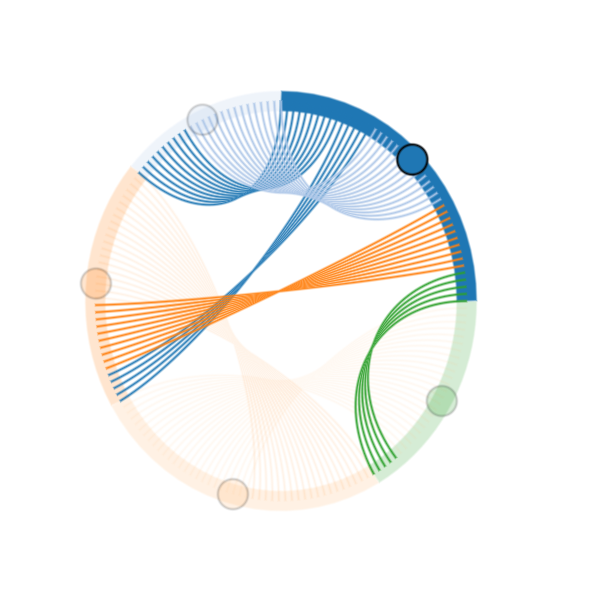
Chord Diagrams: Representing Connections and Flows
Chord diagrams are powerful visualizations that effectively represent the connections and flows between different entities or variables. They provide a clear and intuitive way to understand relationships, collaborations, and network connectivity. In this section, we will explore the components and layout of chord diagrams, analyze their applications in trade relationships and music collaborations, and discuss how interactivity can enhance their effectiveness for deeper exploration.
1. Exploring the Components and Layout of Chord Diagrams
Chord diagrams typically consist of a circular layout, with chords or arcs connecting different entities or categories. The size of each arc represents the magnitude or frequency of a particular connection or flow. The chords, on the other hand, represent the connections between two entities, with their width proportional to the strength of the relationship.
The circular layout of chord diagrams enables easy comparison between different entities and their relationships. The chords are positioned between the corresponding arcs, providing a visual representation of the connections or flows between the entities.
2. Analyzing Trade Relationships, Music Collaborations, and Network Connectivity
Chord diagrams can be applied in various domains to analyze and understand connections and flows. Here are two examples:
a. Trade Relationships
In the context of international trade, chord diagrams can visualize the connections and flows between countries or regions. The arcs represent the different entities (countries), and the chords represent the trade relationships between them. The width of the chords can be used to represent the volume or value of the trade.
By analyzing a trade chord diagram, one can quickly identify the major trading partners of a country, observe the balance or imbalance of trade, and identify any potential dependencies or vulnerabilities in the global trade network.
b. Music Collaborations
Chord diagrams can also be used to visualize music collaborations between different artists or genres. In this case, the arcs represent the artists or genres, and the chords represent the collaborations or connections between them. The width of the chords can be used to represent the frequency or intensity of collaborations.
By examining a music chord diagram, one can observe the patterns of collaborations within a specific genre or across different genres. This can provide insights into the dynamics of the music industry, identify influential artists, and uncover emerging trends and genres.
3. Enhancing Chord Diagrams with Interactivity for Deeper Exploration
To enable deeper exploration and analysis, chord diagrams can be enhanced with interactivity. This allows users to interact with the visualization, filter specific entities or connections, and zoom in on specific details.
Interactive chord diagrams can enable users to explore different aspects such as:
- Highlighting specific entities or connections for detailed analysis.
- Filtering entities or connections based on certain criteria.
- Animating the diagram to show changes over time or different scenarios.
- Providing tooltips or additional information for each entity or connection.
By incorporating interactivity, chord diagrams become powerful tools for in-depth exploration, enabling users to uncover hidden patterns, gain insights, and make informed decisions.
In summary, chord diagrams provide an effective way to represent connections and flows between entities or variables. By understanding their components and layout, analyzing trade relationships and music collaborations, and enhancing them with interactivity, chord diagrams become versatile visualizations that can be used in various domains for deeper exploration and analysis.import holoviews as hv
import pandas as pd
from holoviews import opts
hv.extension(‘bokeh’)
# Sample data for connections between entities
data = {
‘source’: [‘A’, ‘A’, ‘B’, ‘C’, ‘C’, ‘D’, ‘E’],
‘target’: [‘B’, ‘C’, ‘A’, ‘A’, ‘D’, ‘E’, ‘A’],
‘value’: [10, 5, 15, 10, 20, 25, 5]
}
df = pd.DataFrame(data)
# Convert dataframe to chord data
chord_data = hv.Dataset(df, [‘source’, ‘target’], [‘value’])
chord_plot = hv.Chord(chord_data)
# Style the plot
chord_plot.opts(
opts.Chord(cmap=’
Parallel Coordinates: Visualizing Multivariate Data
Parallel coordinate plots are powerful tools for visualizing and analyzing multivariate data. They offer a clear and concise way to represent multiple variables simultaneously, allowing for the identification of patterns, relationships, and outliers within the data set. In this section, we will explore the advantages of using parallel coordinate plots, discuss how they can be used to analyze multivariate data, and provide some tips for optimizing these plots to enhance the clarity of insights.
1. Introduction to Parallel Coordinate Plots and Their Advantages
Parallel coordinate plots, also known as parallel coordinates or parallel coordinate charts, are a type of data visualization that displays multiple numerical variables along parallel axes. Each axis represents a different variable, and the data points are connected by lines that intersect the axes. The position and shape of the lines provide insights into the relationships between the variables.
One of the main advantages of parallel coordinate plots is their ability to visualize high-dimensional data sets. With just a single plot, it is possible to represent and compare data points with multiple variables. This makes it easier to detect patterns or trends that may not be apparent when analyzing the variables separately.
Parallel coordinate plots also allow the identification of outliers or anomalous data points. By observing intersecting lines that deviate significantly from the general pattern, analysts can identify data points that may require further investigation or analysis.
2. Analyzing Multivariate Data and Identifying Patterns and Outliers
When analyzing multivariate data using parallel coordinate plots, it is important to consider the following steps:
a. Data Preprocessing: Before creating a parallel coordinate plot, it is crucial to preprocess the data to ensure consistency and accuracy. This may involve scaling or normalizing the variables to a common range or dealing with missing values.
b. Variable Ordering: The order in which the variables are plotted can affect the readability and interpretability of the plot. Consider arranging the variables in a meaningful order that reflects their importance or logical progression.
c. Identifying Patterns: To identify patterns or relationships between variables, examine the general trends of the lines. Look for parallel lines or lines that move together, indicating a positive correlation between the variables. Conversely, lines that diverge or intersect may indicate negative or no correlation.
d. Detecting Outliers: Outliers can be identified as lines that deviate significantly from the general pattern. These outliers may represent extreme values or errors in the data. Investigate these data points further to understand their causes and potential implications.
3. Tips for Optimizing Parallel Coordinate Plots for Clearer Insights
To optimize parallel coordinate plots and enhance the clarity of insights, consider the following tips:
a. Axis Scaling: Use appropriate scaling for each variable to ensure that they are visually comparable. Consider using logarithmic scales or other transformations if the data spans a wide range.
b. Axis Labeling: Clearly label each axis with the corresponding variable name. This helps viewers understand the meanings and units of the variables.
c. Line Transparency: When dealing with a large number of data points, consider using semi-transparent lines. This reduces clutter and allows for better visualization of overlapping lines.
d. Highlighting Data: Use color or other visual cues to highlight specific data points or groups that are of interest. This can help draw attention to particular patterns or outliers.
e. Interactivity: Provide interactive features that allow users to select and filter data based on specific criteria. This enables a more focused analysis and allows for the exploration of different subsets of the data.
By following these tips, analysts can optimize parallel coordinate plots to effectively communicate insights and facilitate data-driven decision making.
In conclusion, parallel coordinate plots provide a powerful visualization technique for understanding multivariate data. By leveraging their advantages, carefully analyzing the data, and implementing optimization strategies, analysts can unravel complex relationships, identify patterns, and detect outliers in an efficient and visually compelling manner.
from pandas.plotting import parallel_coordinates
import pandas as pd
import matplotlib.pyplot as plt
# Sample data
data = pd.DataFrame({
“Feature1”: [1, 2, 3, 4],
“Feature2”: [4, 3, 2, 1],
“Feature3”: [2, 3, 4, 1],
“Group”: [“A”, “B”, “A”, “B”]
})
parallel_coordinates(data, ‘Group’)
plt.title(‘Parallel Coordinate Plot’)
plt.show()

Conclusion: Embracing the Power of Rare Plots
Rare plots play a crucial role in data science, offering unique insights and perspectives that can uncover hidden patterns and trends. By highlighting outliers and uncommon occurrences, rare plots allow analysts to go beyond traditional analysis methods and gain a deeper understanding of their data.
Throughout this article, we have explored the significance of rare plots and how they can contribute to data science. We have discussed various types of rare plots, such as boxplots, violin plots, and scatter plots, and their applications in different domains.
It is essential for data scientists to embrace the power of rare plots and incorporate them into their analysis workflow. By incorporating rare plots into their visualizations, analysts can bring attention to important outliers or anomalies in the data, which may have significant implications for decision-making or further investigation.
Furthermore, rare plots encourage exploration and experimentation in data visualization. By experimenting with different rare plot techniques and parameters, data scientists can uncover unique insights and visually communicate complex patterns in their data.
For those interested in delving further into the world of rare plots and data visualization, there are numerous resources available for learning and inspiration. Online tutorials and courses can provide a solid foundation in data visualization principles and techniques. Additionally, books and research papers by experts in the field offer in-depth knowledge and innovative approaches.
In conclusion, rare plots are a powerful tool in data science that can reveal valuable insights and drive meaningful decision-making. By embracing the potential of rare plots and continuing to explore and experiment with visualizations, data scientists can unlock the full potential of their data and drive innovation in their respective fields.
References:
- Wilke, C.O. “The Joy of Plotting: Visualizing Changes and Variability in Data Over Time with Joyplots”. Journal of Computational and Graphical Statistics, 2018.
- Kassambara, A. “Joyplots: Introduction, Creation, and Analysis — Visualizations for Machine Learning Results”. StaTechAnnals, 2017.
Github:
https://github.com/ra1111/Data-Visualisation-Python/blob/main/Rare_plots.ipynb