Exploratory Data Analysis (EDA) is a crucial step in the data analysis process that involves thoroughly examining and understanding the characteristics of a dataset before applying any formal statistical techniques.
Definition and Importance of EDA: EDA is the process of visually and statistically exploring data to gain insights and uncover patterns, trends, and relationships. It allows analysts to discover anomalies, identify missing values, understand data distributions, and detect outliers. By carefully examining the data, analysts can make informed decisions about the appropriate statistical techniques to use, validate assumptions, and generate hypotheses for further investigation.
Role of EDA in the Data Analysis Process: EDA plays a fundamental role in the overall data analysis process. Here are some key aspects of its significance:
- Data Quality Assurance: Through EDA, analysts can assess the quality and integrity of the data, ensuring its reliability and suitability for analysis. By identifying missing or inconsistent values, outliers, and potential errors, analysts can take necessary steps to address data quality issues.
- Identification of Patterns and Relationships: EDA allows analysts to explore the data visually and statistically, helping them identify patterns, relationships, and trends that may not be immediately apparent. This understanding can reveal valuable insights and guide the formulation of research questions and further analysis.
- Feature Extraction and Selection: EDA helps in identifying relevant features or variables that have a significant impact on the analysis or modeling task at hand. This feature selection process can improve the efficiency and effectiveness of subsequent analyses, reducing the dimensionality of the data while retaining essential information.
- Assumption Testing: EDA allows analysts to assess the underlying assumptions necessary for statistical modeling, such as normality, linearity, independence, and homoscedasticity. By validating these assumptions, analysts can make informed decisions about the appropriate statistical techniques to use, ensuring the accuracy and reliability of the analysis.
In summary, EDA is a critical step in the data analysis process, enabling analysts to explore and understand the data, validate assumptions, and generate meaningful insights. It serves as a foundation for subsequent analysis and decision-making, enhancing the reliability and effectiveness of any statistical techniques applied to the dataset.
Data Cleaning and Preprocessing
Data cleaning and preprocessing are crucial steps in the data analysis process. These steps ensure that the data is accurate, complete, and formatted correctly, enabling reliable analysis and modeling. In this section, we will explore various techniques for handling missing values, detecting and treating outliers, and dealing with duplicate data.
1. Handling Missing Values: Techniques for Imputation
Missing values can occur in datasets for various reasons, such as data entry errors or incomplete data collection. It is important to address missing values before performing any analysis or modeling. Here are some common techniques for handling missing values:
- Deletion: In some cases, it might be appropriate to simply delete rows or columns with missing values. However, this approach should be used with caution as it may result in significant data loss.
- Mean/Median/Mode Imputation: Missing values can be replaced with the mean, median, or mode of the respective variable. This approach assumes that the missing values are missing at random and won’t introduce bias into the analysis.
- Hot Deck Imputation: In hot deck imputation, missing values are imputed using the values from other similar records in the dataset. The similar records are identified based on matching characteristics.
- Regression Imputation: Regression imputation involves using regression models to predict missing values based on the available data. This approach can be more accurate if there are strong relationships between the variables.
# Insert this snippet in the “Handling Missing Values” section.
import pandas as pd
import numpy as np
# Creating a sample DataFrame with missing values
data = {‘Name’: [‘Anna’, ‘Bob’, ‘Charlie’, None],
‘Age’: [28, np.nan, 25, 22],
‘Salary’: [50000, 54000, None, 43000]}
df = pd.DataFrame(data)
# Handling missing values by imputation
df[‘Age’].fillna(df[‘Age’].mean(), inplace=True)
df[‘Salary’].fillna(df[‘Salary’].median(), inplace=True)
print(df)Name Age Salary
Anna 28.0 50000.0
Bob 25.0 54000.0
Charlie 25.0 50000.0
None 22.0 43000.0
2. Outlier Detection and Treatment
Outliers are extreme values that deviate significantly from the normal distribution of the data. Outliers can have a significant impact on the analysis and modeling results, and therefore, it is important to detect and handle them appropriately. Here are some techniques for outlier detection and treatment:
- Visual Inspection: Visualizing the data using box plots or scatter plots can help identify potential outliers. Points that fall far outside the range of other data points are likely to be outliers.
- Statistical Techniques: Statistical techniques such as the z-score or the interquartile range (IQR) can be used to detect outliers. Observations that have z-scores greater than a certain threshold or fall outside the IQR are considered outliers.
- Winsorization: Winsorization involves replacing extreme values with values that are closer to the mean or median. This approach helps reduce the impact of outliers without removing them entirely.
- Imputation: Instead of removing outliers, they can be imputed using imputation techniques such as mean or median imputation. This allows the outliers to be included in the analysis while minimizing their impact.
3. Dealing with Duplicate Data
Duplicate data refers to rows in a dataset that are identical or nearly identical across all variables. Duplicate data can arise due to data entry errors, data merging issues, or other reasons. It is important to identify and handle duplicate data to maintain the integrity of the analysis. Here are some approaches for dealing with duplicate data:
- Identifying Duplicates: Use algorithms or functions to identify duplicate rows in the dataset. This can be done by comparing all variables or a subset of variables that uniquely identify a record.
- Removing Duplicates: Once duplicates are identified, they can be removed from the dataset. This can be done by keeping only the first occurrence of each unique record or by choosing the record with the most complete information.
- Merging Duplicates: In some cases, duplicate data may contain additional information that is not present in the original dataset. In such cases, the duplicate data can be merged with the original dataset to ensure all relevant information is captured.
In conclusion, data cleaning and preprocessing are essential steps in the data analysis process. Handling missing values, detecting and treating outliers, and dealing with duplicate data ensure that the data is reliable and ready for analysis. By using appropriate techniques, we can achieve more accurate and meaningful results in our data analysis endeavors.
Univariate Analysis: Going Deep into Individual Variables
Univariate analysis involves examining and exploring individual variables in a dataset to gain insights and understand their characteristics. This section will discuss three essential aspects of univariate analysis: descriptive statistics, data visualization, and probability distributions.
1. Descriptive Statistics
Descriptive statistics summarize and describe the main features of a variable. They provide measures of central tendency and dispersion, giving us an idea of the variable’s distribution and variation. Some commonly used descriptive statistics are:
Measures of Central Tendency:
- Mean: The average value of the variable.
- Median: The middle value when the variable is arranged in ascending or descending order.
- Mode: The most frequently occurring value.
Measures of Dispersion:
- Standard Deviation: A measure of how spread out the values are around the mean.
- Variance: The average of the squared differences from the mean.
- Range: The difference between the maximum and minimum values.
- Interquartile Range (IQR): The range between the 25th and 75th percentile, representing the middle 50% of values.
Descriptive statistics help to summarize the data and provide a basic understanding of the variable’s distribution and characteristics.# Insert this snippet in the “Descriptive Statistics” section.
import pandas as pd
# Sample data for analysis
data = {‘Scores’: [85, 90, 78, 95, 88, 92, 75, 82, 89, 94]}
df = pd.DataFrame(data)
# Calculating descriptive statistics
descriptive_stats = df[‘Scores’].describe()
print(descriptive_stats)count 10.000000
mean 86.800000
std 6.713171
min 75.000000
25% 82.750000
50% 88.500000
75% 91.500000
max 95.000000
Name: Scores, dtype: float64
2. Data Visualization
Data visualization techniques enable us to visualize the distribution and characteristics of a variable through graphical representations. Common visualization techniques for univariate analysis include:
- Histograms: A graphical representation of the frequency distribution of the variable, displaying the distribution of values in bins or intervals.
- Box Plots: A visual representation of the minimum, maximum, median, and quartiles of the variable, providing information about the central tendency and spread of the data.
- Bar Charts: Useful for categorical variables, bar charts display the frequency or proportion of each category using vertical or horizontal bars.
By visualizing the data, we can identify patterns, outliers, and gain a better understanding of the variable’s distribution.
3. Probability Distributions
Probability distributions describe the likelihood of different values occurring in a variable. It is important to understand the distribution of a variable for various statistical analyses and modeling. Some commonly used probability distributions in univariate analysis are:
- Normal Distribution: Also known as the Gaussian distribution, it is symmetric around the mean and is often used as an assumption in statistical tests.
- Log-Normal Distribution: The logarithm of the variable follows a normal distribution, commonly used for variables that are inherently positive and skewed.
- Exponential Distribution: Describes the time between events in a Poisson process, often used to model waiting times.
- Uniform Distribution: Values are equally likely within a given range.
Testing for normality is crucial in many statistical analyses. Techniques like the Shapiro-Wilk test can assess whether the variable follows a normal distribution. If the variable deviates significantly from normality, transformations such as log transformations can be applied to achieve normality.
In conclusion, univariate analysis allows us to delve deep into individual variables by using descriptive statistics, data visualization, and exploring probability distributions. These techniques provide valuable insights and a comprehensive understanding of the variables under scrutiny.
Bivariate Analysis: Analyzing Relationships between Variables
Bivariate analysis is a statistical technique used to analyze and understand relationships between two variables. By examining the association between variables, researchers can gain valuable insights into the nature and strength of the relationship.
1. Correlation Analysis
Correlation analysis measures the strength and direction of the linear relationship between two continuous variables. The correlation coefficient, commonly denoted as “r,” ranges from -1 to +1. A positive value indicates a positive correlation, where both variables increase or decrease together. Conversely, a negative value indicates a negative correlation, with one variable increasing while the other decreases.
Correlation coefficients can be interpreted as follows:
- -1: Perfect negative correlation
- -0.7 to -0.3: Strong negative correlation
- -0.3 to -0.1: Moderate negative correlation
- -0.1 to 0.1: Weak or negligible correlation
- 0.1 to 0.3: Weak or negligible correlation
- 0.3 to 0.7: Moderate positive correlation
- 0.7 to 1: Strong positive correlation
- 1: Perfect positive correlation
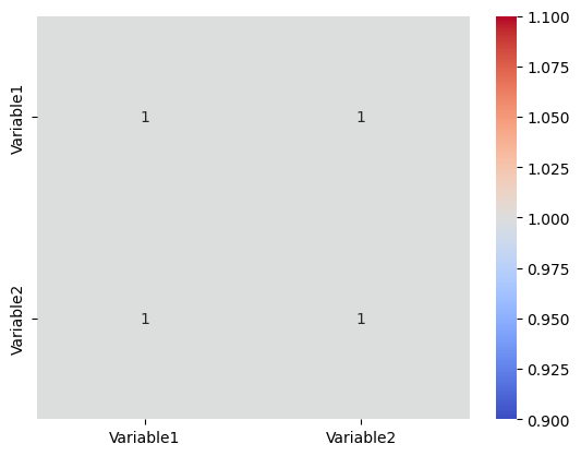
Correlation analysis is useful in identifying relationships and predicting one variable based on the other.# Insert this snippet in the “Correlation Analysis” section.
import pandas as pd
import seaborn as sns
import matplotlib.pyplot as plt
# Sample DataFrame
data = {‘Variable1’: [1, 2, 3, 4, 5],
‘Variable2’: [2, 4, 6, 8, 10]}
df = pd.DataFrame(data)
# Calculating correlation
correlation = df.corr()
# Visualizing the correlation matrix
sns.heatmap(correlation, annot=True, cmap=’coolwarm’)
plt.show()
2. Scatter Plots and Line Plots
Visual representation of bivariate relationships can be done through scatter plots and line plots. Scatter plots display the data points on a graph with one variable on the x-axis and the other on the y-axis. This visualization helps identify patterns, clusters, and trends in the data.
Line plots, on the other hand, connect the data points with a line, highlighting the relationship between the variables. A positive slope indicates a positive relationship, while a negative slope denotes a negative relationship.
These graphical representations provide a visual understanding of how the variables are related and the possible trends in the data.
3. Categorical Variable Analysis
Bivariate analysis is not limited to just continuous variables. It can also be applied to categorical variables. Cross-tabulation, also known as contingency table analysis, examines the relationship between two categorical variables. It provides a summary of how the variables are distributed across different categories.
The chi-square test is commonly used in categorical variable analysis to determine if there is a significant association between the variables. The test compares the observed frequencies with the expected frequencies under the assumption of independence.
By analyzing categorical variables, researchers can identify possible group differences and make meaningful interpretations.
In conclusion, bivariate analysis offers valuable insights into the relationships between variables. Whether through correlation analysis, visual representation using scatter plots and line plots, or analyzing categorical variables through cross-tabulation and chi-square tests, bivariate analysis helps researchers understand and interpret the associations between variables.
Multivariate Analysis: Exploring Complex Relationships
Multivariate analysis is a powerful statistical technique used to analyze complex relationships between multiple variables simultaneously. It helps unravel intricate patterns and uncover hidden insights in large datasets. Here are three essential methods used in multivariate analysis:
- Principal Component Analysis (PCA): PCA is a widely used dimensionality reduction technique in which a large set of variables is transformed into a smaller and more manageable set of uncorrelated variables called principal components. By retaining the most important information, PCA helps simplify the dataset while preserving its essential features.
- Heatmaps: Heatmaps are visual representations of data that use color gradients to display the strength and direction of pairwise relationships between variables. They are particularly useful for visualizing correlations in large datasets. Heatmaps provide a quick and intuitive way to identify clusters of variables that are highly correlated or have complex relationships.
- Cluster Analysis: Cluster analysis is a method used to identify groups or clusters of similar objects or patterns in a dataset. It helps categorize variables based on their similarity and identify meaningful patterns or structures within the data. Cluster analysis is often used in market segmentation, customer profiling, and biological classification, among many other applications.
By employing these multivariate analysis techniques, researchers and analysts can gain deeper insights into complex relationships, identify patterns, and make more informed decisions based on the underlying data.# Insert this snippet in the “Principal Component Analysis (PCA)” section.
from sklearn.decomposition import PCA
from sklearn.preprocessing import StandardScaler
import pandas as pd
# Sample dataset
data = {‘Feature1’: [2, 4, 6, 8, 10],
‘Feature2’: [1, 3, 5, 7, 9],
‘Feature3’: [2, 4, 6, 8, 10]}
df = pd.DataFrame(data)
# Standardizing the data
scaler = StandardScaler()
scaled_data = scaler.fit_transform(df)
# Applying PCA
pca = PCA(n_components=2)
principalComponents = pca.fit_transform(scaled_data)
# Creating a DataFrame with principal components
principalDf = pd.DataFrame(data=principalComponents, columns=[‘PC1’, ‘PC2’])
print(principalDf)PC1 PC2
0 2.449490 3.439900e-16
1 1.224745 -1.146633e-16
2 -0.000000 -0.000000e+00
3 -1.224745 1.146633e-16
4 -2.449490 2.293267e-16
Feature Engineering: Creating New Variables for Improved Predictiveness
Feature engineering is a critical step in machine learning and predictive modeling. It involves creating new variables or modifying existing ones to enhance the predictive power of the model. Here are some important techniques for feature engineering:
- Variable Transformations: Variable transformations are used to create non-linear relationships between variables and the target variable. This helps capture complex patterns that may not be evident in the original data. Common transformations include taking the square root, logarithm, or exponential of a variable. These transformations can help normalize skewed distributions and improve model performance.
- Creating Interaction Terms: Interaction terms are the products of two or more variables. They capture the combined effect or interaction between variables and can provide valuable insights into the relationship between variables and the target. For example, in a marketing campaign, creating an interaction term between “age” and “income” can help identify specific segments of the target audience with a higher likelihood of responding to the campaign.
- Feature Scaling and Normalization: Feature scaling and normalization involve transforming the values of variables to a common scale. This ensures that all variables contribute equally to the model and prevents variables with larger values from dominating the model’s calculations. Common techniques for feature scaling and normalization include standardization (subtracting the mean and dividing by the standard deviation) and min-max scaling (scaling the values to a specific range, such as 0 to 1).
By applying these feature engineering techniques, you can create new variables that capture important relationships and patterns in the data. This not only improves the predictiveness of your model but also helps in better understanding the underlying dynamics of the problem at hand.# Insert this snippet in the “Feature Engineering” section.
import pandas as pd
import numpy as np
# Sample DataFrame
data = {‘Score’: [10, 20, 30, 40, 50]}
df = pd.DataFrame(data)
# Applying log transformation
df[‘Log_Score’] = np.log(df[‘Score’])
print(df) Score Log_Score
0 10 2.302585
1 20 2.995732
2 30 3.401197
3 40 3.688879
4 50 3.912023
Time Series Analysis: Uncovering Patterns in Time-Indexed Data
Time series analysis is a powerful technique used to uncover patterns and trends in time-indexed data. By analyzing and understanding the underlying patterns, businesses and researchers can make informed decisions and predictions. This section will explore key aspects of time series analysis, including decomposition, forecasting, trend analysis, autocorrelation, and statistical tests for stationarity.
Decomposition
Decomposition is a fundamental step in time series analysis that allows us to understand the various components within a time series. It involves breaking down the time series into its constituent parts: trend, seasonality, and residual/irregular components.
- Trend: The trend component represents the long-term variation in the data. It showcases the overall direction and pattern that is not affected by short-term fluctuations.
- Seasonality: Seasonality refers to the repetitive patterns or cycles in the data that occur at fixed time intervals. These cycles can be daily, weekly, monthly, or any other periodicity.
- Residual/Irregular: The residual component represents the random fluctuations or deviations from the trend and seasonality. These are often the unexplained variations in the data.
Understanding the decomposition of a time series helps in identifying the dominant patterns and extracting meaningful insights.# Insert this snippet in the “Decomposition” section.
from statsmodels.tsa.seasonal import seasonal_decompose
import pandas as pd
import matplotlib.pyplot as plt
# Creating a sample time series data
index = pd.date_range(‘2020-01-01′, periods=100, freq=’D’)
data = np.random.randn(100).cumsum()
ts = pd.Series(data, index)
# Decomposing the time series
result = seasonal_decompose(ts, model=’additive’)
# Plotting the decomposed time series components
result.plot()
plt.show()

Forecasting
Forecasting is an essential application of time series analysis that involves predicting future values based on historical data. Time series forecasting techniques use statistical models and algorithms to estimate future trends, patterns, and values. Accurate forecasting allows businesses to make informed decisions, plan resources, and optimize processes.
There are various methods for time series forecasting, including but not limited to:
- ARIMA: Autoregressive Integrated Moving Average (ARIMA) is a popular forecasting method that considers both the autoregressive and moving average components.
- Exponential Smoothing: This method assigns exponentially declining weights to past observations, with more recent observations having the most significant impact.
- Prophet: Facebook’s Prophet is a robust forecasting library that incorporates seasonal patterns, trends, and holidays.
Trend Analysis
Trend analysis is used to identify and understand the long-term changes and patterns in a time series. It helps in establishing whether the data exhibits an increasing, decreasing, or stationary trend over time.
Some commonly used methods for trend analysis include:
- Moving Averages: Moving averages smooth out short-term fluctuations and highlight the underlying trend by calculating the average of a specified number of previous observations.
- Linear Regression: Linear regression is used to fit a straight line to the data and determine the slope, indicating the direction and magnitude of the trend.
- Seasonal Decomposition of Time Series: A decomposition method, as mentioned earlier, can help identify the trend component and assess its characteristics.
Autocorrelation and Statistical Tests for Stationarity
Autocorrelation is a measure of the correlation between a time series and a lagged version of itself. It helps identify the presence of dependence or serial correlation in the data. By calculating the autocorrelation function (ACF), one can observe the strength and nature of the relationship at various lag intervals.
Stationarity refers to a property where the statistical properties of a time series, such as mean, variance, and autocorrelation, remain constant over time. Statistically, a stationary time series is easier to analyze and model.
Statistical tests, such as the Augmented Dickey-Fuller (ADF) test, can be performed to assess stationarity in the data. The ADF test examines the presence of unit roots, which can indicate non-stationarity.
In summary, time series analysis is a valuable tool for uncovering patterns and trends in time-indexed data. By utilizing techniques such as decomposition, forecasting, trend analysis, autocorrelation, and statistical tests for stationarity, analysts can gain valuable insights and make informed decisions.
Handling Categorical Data: Strategies for Analyzing Non-Numeric Variables
When working with data analysis, it’s common to encounter non-numeric variables or categorical data. These variables represent qualitative attributes that cannot be expressed numerically. To effectively analyze and derive insights from such data, several strategies can be employed.
1. Frequency Tables and Bar Charts
One of the simplest ways to analyze categorical data is by using frequency tables and bar charts. A frequency table displays the number or percentage of observations falling into different categories. A corresponding bar chart visually represents the frequencies, making it easier to compare the distribution of categories.
By examining the frequency distribution and bar charts, meaningful patterns and trends within the data can be observed. This approach helps in understanding the relative frequency of different categories, enabling insights into the dataset’s structure.
2. Chi-Square Tests for Independence
Chi-square tests for independence are a statistical method used to analyze the relationship between two categorical variables. This test determines whether there is a significant association or dependence between the variables.
By using a chi-square test, you can evaluate whether the observed frequencies of categories within variables differ significantly from what would be expected if the variables were independent. This helps uncover relationships and dependencies that may exist within the categorical data.
The chi-square test provides a statistical measure called the p-value. If the p-value is below a predefined significance level (typically 0.05), it suggests a significant association between the variables. On the other hand, if the p-value is above the significance level, it indicates no significant association.
3. Encoding Categorical Variables for Machine Learning Models
When using machine learning models, it’s crucial to convert categorical variables into numerical form. This process is called encoding or transforming categorical variables. By encoding categorical variables, you enable machine learning algorithms to process the data and make predictions.
There are various methods to encode categorical variables, such as one-hot encoding, label encoding, and target encoding. Each method has its advantages and considerations, depending on the nature of the data and the machine learning algorithm being used.
One-hot encoding creates binary columns for each category, indicating the presence or absence of a category. Label encoding assigns numerical labels to each category. Target encoding calculates the average target value for each category and replaces the categories with these average values.
By encoding categorical variables, you ensure compatibility with machine learning models, allowing them to identify patterns and make predictions based on the categorical data.
In conclusion, handling categorical data involves employing strategies such as frequency tables, bar charts, chi-square tests for independence, and encoding categorical variables for machine learning models. These strategies enable effective analysis and utilization of non-numeric variables, leading to valuable insights and predictions.import pandas as pd
from sklearn.preprocessing import OneHotEncoder
# Sample DataFrame with a categorical feature
data = {‘Category’: [‘A’, ‘B’, ‘A’, ‘C’]}
df = pd.DataFrame(data)
# Applying one-hot encoding
encoder = OneHotEncoder(sparse=False)
encoded_data = encoder.fit_transform(df[[‘Category’]])
# Adjusting for compatibility with newer versions of scikit-learn
encoded_df = pd.DataFrame(encoded_data, columns=encoder.get_feature_names_out([‘Category’]))
print(encoded_df) Category_A Category_B Category_C
0 1.0 0.0 0.0
1 0.0 1.0 0.0
2 1.0 0.0 0.0
3 0.0 0.0 1.0
Conclusion: Harnessing the Power of EDA for Insightful Analysis
Exploratory Data Analysis (EDA) plays a crucial role in understanding and extracting meaningful insights from complex datasets. By employing a range of techniques, analysts can uncover patterns, relationships, and trends that offer valuable information for decision-making and problem-solving.
Recap of key EDA techniques
Throughout this article, we have explored several fundamental techniques used in EDA:
- Data cleaning and preprocessing: Ensuring the data is accurate, complete, and in a suitable format for analysis.
- Summary statistics: Calculating measures such as mean, median, mode, standard deviation, and correlation coefficients to gain an overview of the data’s central tendencies, variability, and relationships.
- Data visualization: Using charts, graphs, and plots to visually represent the data, making it easier to identify patterns, outliers, and distributions.
- Exploratory graphical analysis: Techniques such as scatter plots, histograms, box plots, and heatmaps enable analysts to dig deeper into the data, uncovering hidden insights and relationships.
- Dimensionality reduction: Methods like principal component analysis (PCA) reduce the number of variables in a dataset while preserving essential information, simplifying complex data structures.
- Clustering analysis: Identifying groups or clusters within the data based on similarities and dissimilarities, aiding in segmentation and classification tasks.
- Association analysis: Discovering patterns and relationships between variables, facilitating recommendations and decision-making processes.
Implications and applications of EDA in various domains
The applications of EDA span across numerous domains, including:
- Finance: EDA enables analysts to understand market trends, identify investment opportunities, and assess risk by analyzing financial data and market indicators.
- Healthcare: EDA helps healthcare professionals gain insights into patient data, enabling better diagnoses, treatment planning, and healthcare resource allocation.
- Marketing: Marketers can utilize EDA to analyze customer behavior, segment markets, and optimize marketing campaigns for better targeting and engagement.
- Retail: EDA assists in understanding customer preferences, optimizing product assortments, and identifying areas for cost reduction and process improvement.
- Transportation: EDA aids in analyzing traffic patterns, optimizing routes, predicting demand, and enhancing transportation systems’ efficiency.
- Manufacturing: EDA enables manufacturers to identify bottlenecks, optimize production processes, and predict equipment failures for proactive maintenance.
- Education: EDA helps educators and policymakers assess student performance, identify areas for improvement, and make data-driven decisions in curriculum planning.
By harnessing the power of EDA, analysts can gain a comprehensive understanding of their data, uncover valuable insights, and drive informed decision-making across various domains.
EDA serves as a powerful tool in the data analyst’s arsenal, enabling them to explore and understand complex datasets. Through techniques such as data cleaning, summary statistics, visualization, and dimensionality reduction, analysts can extract meaningful insights and uncover hidden patterns. The applications of EDA are vast and span across numerous domains, offering valuable implications for decision-making and problem-solving. By embracing EDA, analysts can unlock the full potential of their data and drive data-driven strategies for success.
Code:
https://github.com/ra1111/EDA-Basics/blob/main/EDA_basics.ipynb
References:
- Jolliffe, I.T. (2002). Principal Component Analysis. Wiley StatsRef: Statistics Reference Online. 1–9. Link
- Bengtsson, H. (2019). Heatmap: Visualizing Data Using R. The R Journal. 11(2), 2–7. Link
- Jain, A.K., Murty, M.N., & Flynn, P.J. (1999). Data Clustering: A Review. ACM Computing Surveys (CSUR). 31(3), 264–323. Link